

🎨 UI/UX Designer 📱 Designing simple, beautiful digital experiences 💡 Learning • Designing • Building 🚀 Sharing UI/UX tips & projects
Joined September 2023
- Tweets2.6K
- Following418
- Followers637
- Likes7.8K






UI/UX 🔰 retweeted

Most people scroll past icons.
Designers obsess over them.
These 9 shapes carry more weight than most full screens:
Instant recognition. Zero friction. Zero explanation needed.
If your user has to think for even half a second, the icon failed.

UI/UX 🔰 retweeted
Good UI doesn’t need a tutorial.
These buttons work because they’re
familiar, tactile, and instantly clear.
In a world obsessed with ultra-flat design,
sometimes a little metal and shadow
still communicates better than pure minimalism.

UI/UX 🔰 retweeted
Most “modern” UIs look identical.
The ones that feel premium still sweat every toggle, slider, and button.
A tight control kit isn’t decoration — it’s how you stop users from guessing.
Consistency + craft = trust.

UI/UX 🔰 retweeted
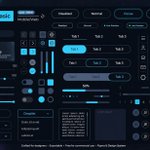
Dark mode isn’t a color swap.
It’s a full system of states, feedback, and hierarchy.
Most “dark themes” fail because the controls feel like an afterthought.
These don’t.
Build the night mode like it’s the default.

UI/UX 🔰 retweeted
Most UI kits look pretty in Figma.
Few survive real products.
Consistency, clear states, and thoughtful defaults
matter more than another gradient slider.
Build systems, not just screens.

UI/UX 🔰 retweeted
Most “beautiful” UIs are just decoration.
The ones people actually keep using nail the boring stuff:
clear search, instant toggles, obvious progress, consistent buttons.
Polish the controls first.
The glow can come later.

UI/UX 🔰 retweeted
Most icon sets try too hard to stand out.
These win by doing the opposite.
Same weight. Same depth. Same quiet confidence.
When your icons feel this consistent, users stop noticing them…
and just use your product.
That’s the real flex.

UI/UX 🔰 retweeted
Most dashboards just report numbers.
The useful ones remove friction.
Tasks, progress, money, and the exact track that keeps you in flow—
all in one glance.
Scattered tools create scattered attention.
One calm surface does the opposite.

UI/UX 🔰 retweeted
Most “modern” UIs still feel broken
because the basics are ignored.
Consistent buttons.
Clear hierarchy.
Accessible contrast.
Simple feedback states.
Light mode doesn’t have to look boring.
It just has to be intentional.
Build the system first.

UI/UX 🔰 retweeted
Most UI kits look fire until you actually use them.
This one nails the basics — clear states and real feedback.
Pretty is easy.
Usable systems that scale are rare.
Build the system first.

UI/UX 🔰 retweeted
Dark mode done right.
Numbers first.
Noise almost zero.
Hierarchy that actually respects the user.
Most finance apps still hide the important stuff under pretty gradients.
Make the data the hero.

UI/UX 🔰 retweeted
Most fleet dashboards just show dots on a map.
The good ones surface the decision you need to make next — required break in 30 min, fuel range, ETA risk.
Visibility isn’t the product.
Actionable awareness is.

UI/UX 🔰 retweeted
Most UX work dies at the checklist.
Visibility. Consistency. Accessibility. Done.
The products people actually love keep going:
Continuous improvement + emotional design.
That’s the difference between “usable” and “I can’t switch.”

Most fintech dashboards still feel like spreadsheets in a tuxedo.
This one gets hierarchy right:
balance first, actions second, context third.
Users don’t need more data.
They need less friction to act on it.
via @charle2creative

1
3
269
Most dashboards track everything
and explain nothing.
Pretty numbers feel productive.
Actionable ones feel uncomfortable.
If your metrics don’t force you to change one thing this week,
they’re just decoration.
via @charle2creative

1
2
600
Most trail apps bury you in numbers.
This one makes remaining distance, wind, elevation, and weekly steps feel alive — clean hierarchy, neon restraint, zero clutter.
Data that motivates instead of overwhelms.
That’s the difference.

1
4
551