

🎨 UI/UX Designer 📱 Designing simple, beautiful digital experiences 💡 Learning • Designing • Building 🚀 Sharing UI/UX tips & projects
Joined September 2023
- Tweets2.6K
- Following412
- Followers636
- Likes7.7K






UI/UX 🔰 retweeted

Most dashboards just report numbers.
The useful ones remove friction.
Tasks, progress, money, and the exact track that keeps you in flow—
all in one glance.
Scattered tools create scattered attention.
One calm surface does the opposite.

UI/UX 🔰 retweeted
Most “modern” UIs still feel broken
because the basics are ignored.
Consistent buttons.
Clear hierarchy.
Accessible contrast.
Simple feedback states.
Light mode doesn’t have to look boring.
It just has to be intentional.
Build the system first.

UI/UX 🔰 retweeted
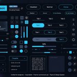
Most UI kits look fire until you actually use them.
This one nails the basics — clear states and real feedback.
Pretty is easy.
Usable systems that scale are rare.
Build the system first.

UI/UX 🔰 retweeted
Dark mode done right.
Numbers first.
Noise almost zero.
Hierarchy that actually respects the user.
Most finance apps still hide the important stuff under pretty gradients.
Make the data the hero.

UI/UX 🔰 retweeted
Most fleet dashboards just show dots on a map.
The good ones surface the decision you need to make next — required break in 30 min, fuel range, ETA risk.
Visibility isn’t the product.
Actionable awareness is.

UI/UX 🔰 retweeted
Most UX work dies at the checklist.
Visibility. Consistency. Accessibility. Done.
The products people actually love keep going:
Continuous improvement + emotional design.
That’s the difference between “usable” and “I can’t switch.”

Most fintech dashboards still feel like spreadsheets in a tuxedo.
This one gets hierarchy right:
balance first, actions second, context third.
Users don’t need more data.
They need less friction to act on it.
via @charle2creative

1
3
261
Most dashboards track everything
and explain nothing.
Pretty numbers feel productive.
Actionable ones feel uncomfortable.
If your metrics don’t force you to change one thing this week,
they’re just decoration.
via @charle2creative

1
2
598
Most trail apps bury you in numbers.
This one makes remaining distance, wind, elevation, and weekly steps feel alive — clean hierarchy, neon restraint, zero clutter.
Data that motivates instead of overwhelms.
That’s the difference.

1
4
550

Most UI kits look clean until you actually ship.
The value isn’t the buttons or progress bars.
It’s forcing one decision early:
“What does consistent mean for this product?”
Skip that and you end up with 4 different button styles and a design that fights itself.

1
3
373
Good morning Nigeria.
FG said N70,000 transport for 6 months starting November.
But my question is simple:
If you are NOT a government worker, who will give you your own N70,000?
Private workers, self-employed, students, hustlers — how are we surviving?
1
3
276