

50x larger sets than other icon libraries. 12 years of meticulous craft. Free version available ✨
Joined February 2019
- Tweets4.1K
- Following148
- Followers3.7K
- Likes3.2K



Pinned Tweet
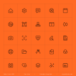
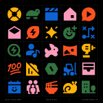
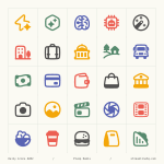
A cheerful mix of essentials ✨

ALT Plump icons in flat style featuring colorful, high-contrast symbols for UI, app, web, dashboard, and creative design. Includes icons for food, travel, media, education, and communication.
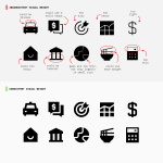
What makes icons consistent?
Part 5/10: Proportion and negative space.
Elements should feel proportionally similar across concepts, so no icon appears unusually large, cramped, or delicate, and the negative space within the grid doesn't look too dense or too open.
Before and after harmonizing Ultimate Light: irregular proportions smoothed into a tidier, more consistent look ✨


What makes icons consistent?
Part 4/10: Gaps and spacing.
The space between lines, shapes, and parts of the icons should stay even across the set, not tight in one icon and loose in another.
A gap that shrinks in one icon and stretches in another is enough to make a simple set feel uneven.
Core Solid keeps that space consistent throughout 👇
What makes icons consistent?
Part 3/10: Line construction.
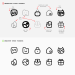
Where a line ends (caps), where two lines meet (joins), and how sharply or smoothly a shape turns a corner (corner radius), all of it should follow one consistent treatment across the set.
A rounded cap here, a sharp join there, an overly rounded corner somewhere. We keep consistency in Micro Line icons by making sure small mismatches like these don't happen.

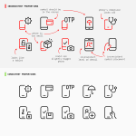
When designing interface icons, the challenge isn't always inventing something new.
Sometimes it's refining what's familiar. Other times, it's giving familiar symbols a new meaning ✨

What makes icons consistent?
Part 3/10: Line construction.
Where a line ends (caps), where two lines meet (joins), and how sharply or smoothly a shape turns a corner (corner radius), all of it should follow one consistent treatment across the set.
A rounded cap here, a sharp join there, an overly rounded corner somewhere. We keep consistency in Micro Line icons by making sure small mismatches like these don't happen.

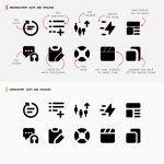
What makes icons consistent?
Part 2/10: Visual weight.
Icons should look equally heavy or light across the set, despite having different shapes or levels of detail.
Nothing looks too light or too heavy. Equal visual weight ensures consistency ✨


What makes icons consistent?
Part 1/10: Stroke weight.
Every icon should use the exact same line thickness, with no icon running thinner or thicker than the rest.
Same Flex Line icons, same stroke weight. Consistency starts with something this simple 👇

An icon can be perfectly functional in isolation but still feel wrong next to the rest of the library.
This is because consistency in icon design is the result of many small decisions working together: stroke weight, proportion, spacing, perspective, level of detail, metaphor choices, and more.
A slightly heavier stroke, an unusually tight gap, or a metaphor that feels too playful can be enough to break the connection.


An icon library is a visual system made of hundreds or thousands of individual decisions.
The real challenge is not drawing one good icon. It is drawing the thousandth icon so it still feels like it was made by the same hand, using the same visual language.
The AI icons, marked in green, are some of the newest additions to Ultimate's 18,000+ icons. More than a decade after the set began, they still follow the same rules ✨


