

A Fresh Perspective on Your Customer Journey Through Lean Design & Dev. Trusted by 12,000+ brands like Loop, Huel, Corkcicle, & Dr. Squatch. Try Oddit FREE ⬇️
Joined January 2021
- Tweets4.9K
- Following403
- Followers12.9K
- Likes3.8K




Pinned Tweet
One question we get asked a lot by new customers (rightfully so) – "What can we expect the results to be?"
As a design-focused company, it's always hard to track results, because its up to our customers if they want to share data with us. We have amazing relationships with our clients, even though for many of them the project ends with their report being delivered.
One of the primary goals of the refresh we've been going through is to be more vocal about our successes, and our customers. While we'll never be able to promise specific results, we consistently see the value of a fresh perspective regardless of what you're selling.
Here's a quick look at how Inspired Go paid back their Oddit within 12hrs of implementing it.

What changed between these two product pages? 🍑
Hint: it’s not the product. It’s how the offer is shown.

This PULSIO section makes choosing the right recovery device easier.
Lifestyle visuals show each product in action.
Key specs highlight the differences.
Clear CTAs give shoppers a direct path to each product.
Less digging through product pages. More confidence in the choice.

Make the CTA More Product-Focused
Mochi Health adds a small product visual right next to the “Get started” CTA.
A simple detail that makes the button stand out and connects the action back to the offer.
More visual context.
More attention on the CTA.
A clearer reason to click.

Oddit A/B Testing Is Coming.
Better UX is one thing. Proving what works is another.
We’re launching A/B Testing for Shopify brands ready to test smarter and improve conversions.
We’re opening a limited beta at discounted rates.
Want in?
Join the beta: oddit.co/pages/ab-testing

Turn the Mobile Menu Into a Mini Storefront
This Aurivita redesign makes the menu do more than show links.
1️⃣ Free shipping offer stays visible.
2️⃣ Featured products show ratings, savings, and benefits.
3️⃣ Support links are easy to access.
4️⃣ Customer reviews build trust.
5️⃣ Clear “Find Your Formula” CTA guides the next step.
A better way to turn navigation into a shopping opportunity.

This hero does a great job balancing product visuals with a clear message.
Strong headline.
Social proof above the fold.
Product UI shown in action.
Clear value proposition.
Separate CTAs for creators and fans.
Different audiences, different goals.
One clear starting point.

A Comparison That Makes the Choice Easy 🍫
Dirty Gut turns a simple comparison table into something fun, bold, and easy to scan.
Instead of overwhelming shoppers with ingredient details, it uses playful visuals and clear callouts to show what makes its chocolate different.
A great example of making product benefits both informative and memorable.

Diet Smoke saw a 25% increase in sitewide conversion rate after working with Oddit.
That’s an estimated $75K more in monthly revenue.
They made back their Oddit investment in just 36 hours.
Better UX. Real results.

We’re tearing down websites live before Black Friday.
Get fresh eyes on your site, spot the friction, and see what to fix before BFCM traffic hits.
Oct 15th @ 2pm ET
RSVP now to submit your site:
us06web.zoom.us/webinar/regi…

Build & Launch Your Shopify Designs
Oddit turns conversion-focused designs into clean
Shopify builds that feel fast, sharp, and easy to shop.
Design and dev, all under one roof.
oddit.co/pages/shopify-devel…

Not every brand needs a full redesign.
Sometimes the problem is one
part of the journey.
The nav is messy.
The buy box is weak.
The cart has friction.
The hero isn’t clear enough.
Oddit Minis makes the fix focused.
Pick the problem.
Get the conversion work.
Move faster.
oddit.co/collections/oddit-m…

Popups work better when they feel like a small moment, not just another email box.
This one uses a scratch-to-reveal mechanic to make the offer feel more engaging.
First, it creates curiosity.
Then it reveals the reward.
Then it asks for the email.
Simple flow:
Play first.
Reward second.
Signup third.
That makes the discount feel more fun to unlock.

53% of $10M+ Shopify brands didn’t double a normal month’s revenue in Nov or Dec 2025.
So what happened to the other half?
Our friends at Shoplift + Northbeam are breaking down BFCM ad spend, site testing, and what brands can learn before this year’s rush.
Free webinar + playbook.
Oct 8, 11 AM ET.
Save your spot:
shoplift.ai/playbook/bfcm-fo…

Health routines can feel vague when results take time.
This section explains the full 90-day protocol in a way that’s easy to follow.
Day ranges are broken into clear stages.
Each stage explains what’s happening.
The desktop version gives a full timeline view.
The mobile version turns it into simple accordions.
Less mystery around the wait.
More confidence in the routine.

Made The Leela's mobile homepage feel worth booking 👇
Before: cluttered header, rotating carousel, no clear next step
After:
1️⃣ Clean promo bar ("Unlock the Privileges of Leela DISCOVERY")
2️⃣ One clear "Book Now" CTA up top
3️⃣ Trust badge ("Rated No. 2 Hotel Brand in the World")
4️⃣ Benefit-driven headline (Enter the World of True Indian Luxury)
5️⃣ Full-bleed hero image that sells the stay
6️⃣ Dominant "Book Your Stay" CTA
7️⃣ "Explore Hotels" as the secondary path + 40 years of credibility

Make Flavor Discovery Feel Fun
This section makes the product lineup easy to understand at a glance.
Classic Milk.
Rich Dark.
Sea Salt Crunch.
Variety Pack.
Each card shows the flavor, product benefit, and quick nutrition details without making the page feel boring.

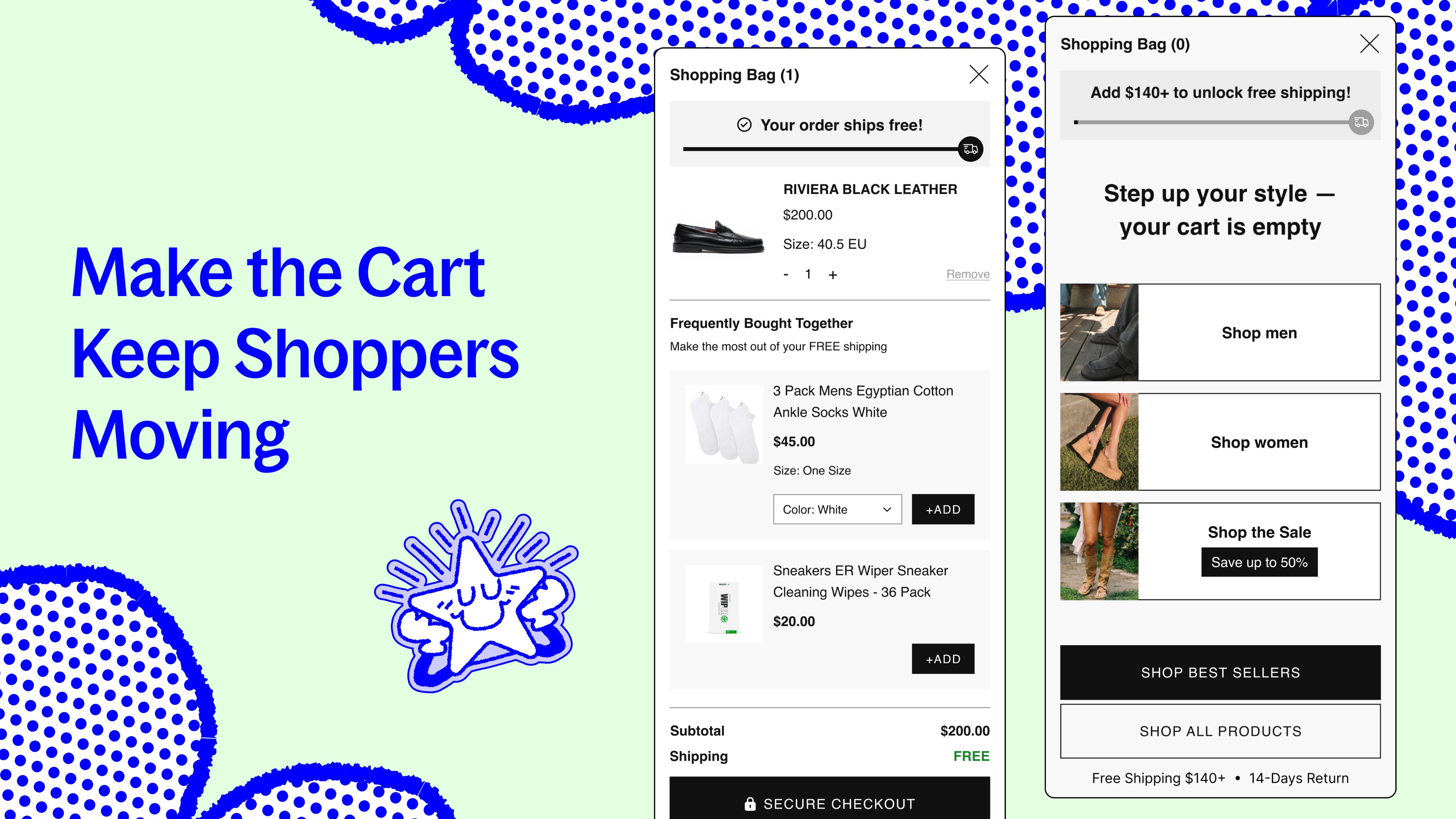
This cart drawer does more than hold products.
It uses the space to guide the next step:
Free shipping progress.
Relevant add-ons.
Clear subtotal.
Strong checkout CTA.
Empty cart shortcuts.
Best sellers + sale paths.
Whether the cart has items or not, the drawer still keeps the shopping journey alive.
Picking the right dog bed size can slow shoppers down.
This section makes the decision easier with clear size cards, weight ranges, sleep area details, prices, and dog silhouettes for quick reference.
The measuring guide underneath adds one more layer of confidence.

