

Alabama Native, Football Fan, and all around NERD! GO STALLIONS! ROLL TIDE! Long Live the UFL!!
Tuscaloosa, AL
Joined April 2009
- Tweets3.2K
- Following595
- Followers192
- Likes6.5K





My Name is NASH retweeted

wheelin and dealin‼️

ALT Win graphic with a dark teal background. “WIN” is along the bottom of the graphic in red outlined lettering. An image of the Kraken celebrating a goal is overlayed in the center of the graphic. The Amazon logo, Red Wings logo, Kraken logo and score are along the top of the graphic. The final score is 4-3, Kraken.
My Name is NASH retweeted

ssttaaallliiioooonnnn nnnaattiooonnn!!!
it's a new era in birmingham 😤
@NewEraCap
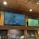
I got @TheUFL on at Mugshots after attending the @UFLStallions pep rally! #unitedbyfootball Time for @UFLAviators @UFLRenegades round 2!!


My Name is NASH retweeted

In the history of Alabama football, there have been few players who loved to compete more than AJ McCarron
abc3340.com/sports/more-spor…

This spot got me ready to RUN 👏 THROUGH 👏 A 👏 WALL 👏!!! Let’s GOOO STALLIONS!!! #GIDDYUP #UFL #springfootball

My Name is NASH retweeted

Survey Says!
It’s about that time everyone!
2026 #UFL Kickoff - Who you taking?


52%Kings
48%Stallions
91 votes • Final results


My Name is NASH retweeted
pick games on your schedule, save some bucks 👀
pick any 3 Stallions home games and save with 3-Game Flex Pack!
🎟️: bit.ly/46fcVGk

Green is hard to get right. This is close to the fun of Oregon but I feel there could have been a better choice for helmet design. But the colors are fun and I love the grey away kit! Diamonds? Ok I guess.
Final rank!
1. 🎰
2. ✈️
3. 🤠
4. 🦅
5. 👑
6. 🛡️
7. 🐎
8. ⛈️
#theUFL


Bold colors are muted in this all black theme. Details may come out better in the sun but I wanted more purple in the home jersey. It just doesn't stand out. like they pulled back a good idea at the last minute.
1. 🎰
2. ✈️
3. 🤠
4. 🦅
5. 🛡️
6. 🐎
7. 🌩️
8.
#theUFL


It’s hard to go wrong with Black. I feel like this is what the former LA Wildcats were aiming for! No notes - they avoided a ketchup and mustard feel by leaning into the casino motif. Easy #1 so far! Chip on the shoulder!
1. 🎰
2. ✈️
3. 🤠
4. 🦅
5. 🛡️
6. 🐎
7.
8.
#theUFL


I mean this as a complement - The Frisco Fighters are back! I love the use of the accent red. Only note is maybe mirror the logo on the left side so both are flying forward. Enough here to distance from Dallas and set own identity.
1.
2. ✈️
3. 🤠
4. 🦅
5. 🛡️
6. 🐎
7.
8.
#theUFL


This color would look good as an alternate, but not at the expense of the main reds. The helmet color is a downgrade. Gold helmet was a part of Bham history. Only good is that we don't share any colors with any other teams.
1.
2.
3. 🤠
4. 🦅
5. 🛡️
6. 🐎
7.
8.
#theUFL

They took the number off the shoulder and put the logo there instead. better STL arch stripe on the shoulder 👍 They keep sliding backwards on the helmet. All things considered, not better than STL 1.0 but lateral move from 2.0
1.
2.
3. 🤠
4. 🦅
5. 🛡️
6.
7.
8.
#theUFL

