

Funnels & CRO for Landing Pages for 7-8 Figures Ecom Brands • Trusted by Old School Labs™, MaryRuth Organics™, Nuorganic T™, and more.
Chicago, IL
Joined October 2023
- Tweets5.5K
- Following1.3K
- Followers5.3K
- Likes20.2K

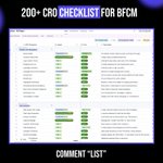





Copy-paste Black Friday conversion checkpoints for your store
Black Friday sends the traffic. Your store decides how much of it turns into revenue.
We built a page-by-page checklist of conversion checkpoints, each scored for impact and effort, so you know exactly what to fix first.
Here’s what’s inside:
1/ Header and navigation
Make sure shoppers can find your Black Friday offers within seconds.
2/ Hero section
Turn a generic sale banner into a reason to keep scrolling.
3/ Categories and products
Remove the friction between browsing and clicking into a product.
4/ Social proof and trust
Make the deal feel safe, not too good to be true.
5/ FAQ and footer
Answer shipping, returns and sizing questions before they kill the sale.
6/ Cart
Catch the quiet drop-offs before checkout.
7/ Checkout
Spot where revenue slips away at the last step.
Want the full checklist? Comment “LIST” and I’ll send it over.
follow (so I can dm)

The Shopify section prompt for building high-converting landing page sections before BFCM.
Screenshot any section from a top DTC brand. Get a paste-ready Dawn version back in minutes.
Built in Claude, ready to run on your next product.
Here’s what’s inside:
Steal the Layout:
↳ Section Recreator: matches spacing, typography, shadows, gradients and hover states from one screenshot
↳ Mobile Builder: a real mobile layout, since most of your BFCM traffic is on phones
↳ Interaction Engine: sliders, accordions, tabs, marquees and reveals in vanilla JS
Build the Page:
↳ Hero and Banner sections, edited in the Theme Editor
↳ Benefits, Feature Cards and Comparison Rows via blocks
↳ Testimonials, Review Walls and Logo Bars via blocks
↳ FAQ and Objection Handling via accordion blocks
↳ Stats, Badges and Guarantee sections
Close the Sale:
↳ CRO-first structure: visual hierarchy, whitespace and CTA placement built for conversion
↳ Social proof blocks: add and reorder reviews without touching code
↳ Page-type matching: homepage, product page or collection page conventions
Scale:
↳ Duplicate one section across unlimited landers, with scoped CSS so nothing breaks
↳ Fully self-contained: one file, no apps, no assets, no theme edits
↳ Editing guide + placeholder checklist with every output
Spin up a new lander section in minutes, not days.
Do you want it? Comment “PROMPT” and I’ll send it over.

13
5
276
who owns resilia btw?

Resilia's payment processor is the one who should be scared this Halloween
576 Trustpilot reviews, 1.4 stars
71% of them are 1 star
365 BBB complaints in 2 years
The reviews keep saying the same thing
They bought once and got put on a subscription they didn't know about
Every one of those customers is one call to their bank away from a chargeback
547


10 Claude prompts for spinning out landing pages before BFCM.
The same page-per-angle approach behind brands doing $100M+ a year.
Built in Notion and Claude, ready to run on your next product.
Here’s what’s inside:
Find the Angle:
↳ Angle Miner: pulls angles from 250+ real reviews (est. 3M+ units sold at Blissy, $53M in 6 months est.)
↳ Avatar and Awareness Map: 5 awareness levels, 3-5 subavatars per product
Write the Page:
↳ Elite Landing Page Creator: hero, full lander, HTML and plain text in one run
↳ Hero Variation Lab: 6 different heroes per angle
↳ Listicle Builder: the Blissy-style funnel, 5-9 reasons per page
↳ Mechanism and Solution Section: 3 versions (short, medium, long)
Close the Sale:
↳ Social Proof Assembler: 12 top proofs ranked
↳ Offer, Guarantee and Congruence: breakeven ROAS at full price vs. offer
↳ Objections and FAQ Builder: top 10 objections, 5-7 FAQs
Scale:
↳ Lander Diversification Planner: 6-10 landers per product
↳ 17-point BFCM CRO Checklist
↳ 15 example landers to study
Do you want it? Comment “LANDER” and I’ll send it over.

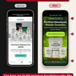
Before / after: Black Girl Sunglasses hero section.
Most brands treat the hero like a place to say everything.
It’s a place to say one thing, fast.
A visitor should understand your offer in 3 seconds. If they have to read a paragraph, you’ve already lost them.
Here’s what the new hero does:
- One clear promise. Who it’s for + what they get, in one line.
- A specific reason to click. Not “Shop Now.” Tell them exactly what happens when they do: “Shop the [offer]” or “Get [benefit].”
- Proof above the fold. Rating, review count, or a customer photo, so they don’t scroll to feel safe.
- Risk removed next to the button. Money-back guarantee, free returns, whatever you offer, sitting right under the CTA where doubt happens.

1
4
233
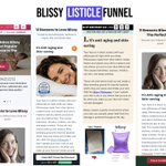
Look at Blissy’s listicle funnel. It’s a 9-figure brand with some of the best landing pages in DTC.
Look at how they position the product with listicles.
Every ad goes to a different listicle. Different persona, different avatar, different angle.
One angle could be:
→ Anti-aging pillowcase
→ Solves acne
→ Better skin overnight
Each listicle educates the top-of-funnel buyer.
By the time they click through to the offer page, they’re warm and already sold on why they need it.
If you’re running a health and wellness brand, warm up your TOF traffic.

You're running a BUNCH of different ad creatives, angles and offers
But are you driving all differing traffic sources to the same page?
Here's why this could potentially be an issue in your conversions + revenue per session...

2
178
Driving ALL your traffic to the same product pages could be problematic
The reason for this is because of the lack of clarity and continuity between the ads you're running and their messaging with the page they land on
Your solution is to create message/ad-specific landers
1
41

Nubuu Detox might have the smartest direct response funnel in health right now.
Everyone diversifies creatives. Almost nobody diversifies landers.
Same product. One VSL per angle, each feeding a different advertorial:
→ Sciatica
→ Anti-aging
→ Blood circulation
Different pain point, different avatar, different “this is for me” moment.
And they never stop testing.
If you sell a health product, stop A/B testing headlines and start testing angles. Subavatars and avatars, all leading to the same offer.
Creative diversification gets the click. Lander diversification keeps your CAC low

this offer page prints $100k days easily, let's break it down...
first off, they have a countdown timer right before the copy, creating urgency from the get go.
then you have product benefits in bullet points, making it easier for visitors to understand what they're actually buying.
next is the bundle & save offer to maximize AOV.
3 tiers: $34.99, $69.98 and $104.97.
the middle offer is marked most popular, and that's where they're likely pushing most buyers. estimated AOV around $70.
then comes the free gift.
but here's what i like, it's not some random freebie thrown in to make the offer look better.
it's a pheromone cologne that complements the actual product and extends the core benefit.
then they have a auto selected membership push to increase LTV and get customers into recurring revenue.
lastly, the 30-day money-back guarantee to take away the buyer's risk.
every single element has a purpose.
this is why you need to intentionally curate your offer page. it's arguably the most important part of your funnel.

I broke down 3 NativePath Meta funnels so you don’t have to.
Same brand. Different products. Same script.
Here’s why it prints...
Step 1: Open with direct response lead, not features
hiding swollen ankles
mapping bathrooms before leaving the house
Pain first. Product last.
Step 2: Burn every obvious fix
cut salt, compression socks, fish oil
“doctor after doctor”
“you’re just getting older”
By the time the product shows up, the reader has nothing left to try.
Step 3: Make their current solution the villain
Ankles page: your fish oil is the problem
Bladder page: drinking water is the problem
Now the new mechanism feels like a discovery, not a pitch.
Step 4: One small study, one big story
Krill vs fish oil. Amino acids vs water.
Doesn’t need to be huge. Needs to be quotable.
Step 5: Guarantee BEFORE the price
365-day guarantee mentioned before the offer, then again after.
Risk is gone before they see the number.
Step 6: Anchor and push the bundle
$57 crossed out > $21 a bottle at 6 bottles.
The cheapest-per-unit option is the whole point of the page.
The tell that it’s a machine:
Same phrases on both pages.
Numbered page IDs. “v5” in the slug.
Dozens of collagen variants live at once.
They’re not running a page. They’re running a CRO testing system.
Advertorial > Offer Page > Checkout
Your CRO efforts shouldn't be one off tests, they should be a continuous testing system.


