

Scaling Brands with CRO & High Converting Landing Pages. Worked With @kiierrhairgrow @FarmerBills @boreomeQC @HealthYSolSoap
Get in touch →
Joined May 2024
- Tweets10.1K
- Following3.1K
- Followers9.8K
- Likes24.9K




CRO & Landing Pages retweeted
Looking for facebook ads consultant for one of my clients that have worked with 7-9 figure brands before.
Comment or DM me


CRO & Landing Pages retweeted
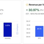
+23.55% CVR
+30.97% RPV
+$107,762/month added
From one page change.
Most brands do this:
Dump cold traffic onto a PDP… then wonder why nothing moves.
Here’s the truth:
PDPs are built for people who already want the product.
Cold traffic needs education, trust, and objection handling, not a product page.
So we rebuilt their PDP into a cold-traffic LP.
Same product. Same ads. Same offer.
Only the page changed.
The results?
• +23.55% CVR
• +30.97% RPV
• $107,762/month projected lift
Founders rarely have an ad problem.
They have a “sending traffic to the wrong page” problem.


CRO & Landing Pages retweeted
Just wrapped a full infographic system for an emergency radio brand, and this is how you sell a preparedness product to cold traffic.
These visuals answer every question buyers have before purchasing:
"Why do I need this?"
"What can it actually power?"
"How is it different from other emergency radios?"
"Will it hold up in a real emergency?"
"What's included?"
"Can I trust it?"
all before they hit the buy button.
Here's the structure (steal this):
1️⃣ Problem → Solution
"When your phone can't handle it alone."
Lead with the real problem:
power outages, losing communication, and being left in the dark.
Sell the outcome, not the radio.
2️⃣ Everyday Utility
Show exactly what it powers.
Phones. Tablets. GPS. Flashlights. Fans.
People buy products they can immediately imagine themselves using.
3️⃣ Comparison Table
20,000 mAh vs. ordinary emergency radios.
No hype.
Just a clear comparison that makes the better choice obvious.
4️⃣ Complete Solution Positioning
One radio. Three emergency essentials.
Radio + power bank + emergency light.
This shifts the conversation from features to preparedness.
5️⃣ Built For Tough Conditions
Solar charging. Hand crank. Storms. Blackouts.
Show the product surviving the environments it's designed for.
6️⃣ Social Proof
Real customer stories from actual outages.
Not:
"Great product!"
But:
"It kept my phone charged through a two-day blackout."
Specific experiences create belief.
7️⃣ What's In The Box
Show every included item.
The fewer unanswered questions, the easier the purchase decision.
8️⃣ Technical Specs
Battery capacity, charging methods, radio bands, outputs.
Turn technical details into buying confidence.
9️⃣ Risk Reversal
30-day money-back guarantee.
The easiest way to increase trust is to reduce risk.
This infographic arc educates, positions, builds confidence, and removes friction in seconds, exactly what cold traffic needs for preparedness products.
If you're selling products people hope they'll never need, your visuals have to convince them before the emergency happens. Otherwise, you're quietly bleeding CVR.


CRO & Landing Pages retweeted
Just wrapped a full infographic system for a pet probiotic brand, and this is how you sell a trust-dependent pet health product to cold traffic.
These visuals answer every question dog owners have before purchasing:
"What does this actually help with?"
"Why is this different from other probiotics?"
"When will I see results?"
"How do I give it to my dog?"
"Why should I trust this brand?"
all before they hit the buy button.
Here's the structure (steal this):
1️⃣ Outcome-First Promise
"Real relief for your dog's digestion, skin & daily comfort."
Lead with the outcomes owners care about:
less itching, healthier digestion, stronger immunity, and happier dogs.
Not ingredients.
Not science jargon.
2️⃣ Simple Visual Mechanism
"Cold-Processed. Never Baked."
Show why the product works.
The moment people understand that heat destroys probiotic cultures, the premium becomes easy to justify.
3️⃣ Expectation Setting
"What To Expect"
Week-by-week progress.
Most supplement brands never explain the timeline.
Showing when owners can expect changes builds patience and increases trust.
4️⃣ Usage Made Simple
Easy dosage based on your dog's weight.
The less people have to think, the more likely they are to buy.
5️⃣ Real Customer Proof
A believable review tied to a specific result.
Not:
"My dog loves it."
But:
"His itching stopped, digestion improved, and we needed fewer tablets."
Specificity builds belief.
6️⃣ Brand Positioning
"Why Thousands Choose Good For Pets"
Cold-processed. Vet-approved. Made in Britain. Mission-driven.
A positioning infographic answers "Why this brand?" before shoppers ask it.
This infographic arc educates, differentiates, builds belief, and removes friction in seconds, exactly what cold traffic needs for pet supplements.
If you're selling a pet health product and your visuals aren't answering these questions upfront, you're quietly bleeding CVR.


CRO & Landing Pages retweeted
Just wrapped a full infographic system for a joint health supplement brand, and this is how you sell a trust-dependent health product to cold traffic.
These visuals answer every question buyers have before purchasing:
"What does this actually do?"
"How does it work?"
"Why is it different?"
"When will I notice results?"
"Can I trust it?"
all before they hit the buy button.
Here's the structure (steal this):
1️⃣ Outcome-First Promise
"Everything your joints need to move comfortably again."
Lead with the outcome people want:
less stiffness, better mobility, and smoother movement.
Not ingredients.
Not science jargon.
2️⃣ Simple Visual Mechanism
"How It Works"
Break the process into 3 simple steps:
absorption → circulation → joint support.
If people don't understand the mechanism, they won't believe the result.
3️⃣ Differentiation Framework
"Why Adults Over 55 Choose VitalHydra"
A comparison table instantly answers:
"Why should I choose this over every other supplement?"
Positioning beats persuasion.
4️⃣ Expectation Setting
"The 14-Day Transformation"
Most supplement brands skip this.
Showing what happens from Day 1 to Day 14 reduces skepticism and keeps customers committed.
5️⃣ Real Customer Proof
A face, a story, and a specific outcome.
Not:
"Amazing product!"
But:
"I can walk stairs again."
Specificity builds belief.
6️⃣ Risk Reversal
50,000+ customers + 60-day money-back guarantee.
The easiest way to increase trust is to reduce risk.
This infographic arc educates, differentiates, builds belief, and removes friction in seconds, exactly what cold traffic needs for health supplements.
If you're selling a supplement and your visuals aren't answering these questions upfront, you're quietly bleeding CVR.

CRO & Landing Pages retweeted
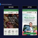
Before & After for Gum of Gods
Same traffic, new LP
+105.75% Conversion Rate
+99.72% Revenue per Visitor


CRO & Landing Pages retweeted
Just wrapped a full infographic system for a natural remedies book, and this is how you sell an information product to cold traffic.
These visuals answer every question buyers have before purchasing:
"What am I actually getting?"
"How is this different from other herbal books?"
"What's inside?"
"Is it worth buying?"
all before they hit the buy button.
Here's the structure (steal this):
1️⃣ Clear Value Breakdown
"What am I actually getting?"
Show exactly what the buyer receives:
step-by-step remedies, practical guides, family-use references, and ready-to-use solutions.
Clarity sells.
2️⃣ Differentiation Framework
"What makes this book different?"
Organization by ailments, sourcing guides, and ingredient indexes.
This instantly separates it from generic herbal books.
3️⃣ Product Preview
A sneak peek inside.
Interior pages, illustrations, recipes, and layouts.
The more tangible an information product feels, the easier it is to buy.
4️⃣ Real Customer Proof
A believable review from an actual reader.
Not "great book."
Specific reasons they found value in it.
That's what builds trust.
5️⃣ Risk Reversal + Popularity Proof
10,000+ copies sold + 30-day guarantee.
Removes the final hesitation and makes the purchase feel safe.
This infographic arc builds trust, demonstrates value, and de-risks the purchase in seconds, exactly what cold traffic needs for books and information products.
If you're selling knowledge and your visuals aren't answering these questions upfront, you're quietly bleeding CVR.


CRO & Landing Pages retweeted
Just wrapped a full infographic system for a weighted plush brand, and this is how you sell an emotional comfort product to cold traffic.
These visuals answer every question buyers have before purchasing:
"Why is this different from a regular plush?"
"Does it actually help?"
"Who is it for?"
"Can I justify spending more on this?"
all before they hit the buy button.
Here's the structure (steal this):
1️⃣ Outcome-First Promise + Social Proof
"Why 14,700+ people love their capybara."
Lead with emotional outcomes people actually want:
stress relief, comfort, relaxation, and better sleep.
2️⃣ Comparison Table (Weighted vs Regular Plush)
Instant positioning.
Shows why this isn't just another stuffed animal:
weighted comfort, heat pouch, cooling relief, and calming pressure.
3️⃣ Use-Case Education
Hug it. Heat it. Chill it.
The faster people understand how they'll use it, the easier the purchase becomes.
4️⃣ Customer Self-Identification
Partners. Kids. Students. Anxious friends.
People buy faster when they immediately see themselves (or someone they know) using the product.
5️⃣ Real Customer Proof
A believable review tied to a specific outcome.
Not "I love it."
Actual results:
better comfort, relaxation, and relief.
This infographic arc builds desire, justifies the premium, and removes doubt in seconds, exactly what cold traffic needs for emotional products.
If your product is driven by feelings and you're not visualizing the outcomes this clearly, you're quietly bleeding CVR.
