

Join the logo obsession. Revealing hidden stories, golden ratios & clever symmetries in famous brands.
Joined September 2023
- Tweets347
- Following194
- Followers8.8K
- Likes101








Pinned Tweet
The Japan Railways (JR) Group logo, introduced in 1987 following the privatization of Japan National Railways, was created through a collaborative design effort led by the Nippon Design Center. Yusuke Kaji served as Creative Director, guiding the overall visual identity strategy, while Yoji Yamamoto acted as Art Director and principal designer of the distinctive “JR” letterform. The project was further supported by Kazumasa Nagai, who functioned as Supervising Editor and provided senior creative oversight, and Ikuo Kenmori, who worked as Producer, coordinating the development and implementation of the identity system. Together, this team designed a bold, connected logotype intended to remain legible at high speeds and across varied applications such as trains, signage, and printed materials. The resulting design allowed each regional JR company to adopt its own color variation while maintaining a unified national symbol, helping establish one of the most recognizable transportation brands in the world.
#logodecks

No Bullsh*t Branding: How Made By James changed the logo design game forever.
Great branding doesn't start on a computer screen, it starts with a pencil and a raw idea. James Martin, the visionary creative behind Made By James, has spent over 20 years proving exactly that.
With over two decades of industry experience, James has stripped the corporate stuffiness out of branding. As a Canva Design Advisory Board member and partner to Affinity and Lincoln Design Co., he has built a massive global community by showing what others hide: the raw, messy, brilliant creative process.
His hit books, Made by James and No Bullsh*t Branding, serve as the ultimate handbooks for turning rough sketchbook grids into iconic, human-centric visual identities. He proves that memorable branding isn't just about polished vectors, it is built on behaviour, trust, and honest, gritty creativity.
#logodecks

The Red Square That Took Uniqlo Global.
Kashiwa Sato, born in Tokyo in 1965, is one of Japan’s most influential creative directors. After 11 years at Hakuhodo he founded Samurai in 2000, building a practice defined by radical simplicity and cultural clarity.
In 2006 he redesigned Uniqlo’s logo for the brand’s New York SoHo flagship. He placed a custom “UNIQLO” wordmark, stacked and precise, inside a bright red square that echoes the Japanese flag. A matching Katakana version (“ユニクロ”) was created so the mark could speak to both domestic and international audiences.
The result is bold, memorable, and unmistakably Japanese yet universal. It became the official logo in Japan by 2009 and still anchors Uniqlo’s global identity today. Sato also shaped store design and the UT T-shirt line, proving that quiet, rigorous design can power a worldwide fashion brand.
#logodecks

Three Diamonds Born from Two Family Crests.
Iwasaki Yatarō (1835–1885), a samurai-born entrepreneur from Tosa, founded Mitsubishi in 1870 as a shipping company during Japan’s Meiji Restoration. He rapidly expanded into mining, shipbuilding and finance, helping shape the country’s modern industrial economy.
The three-diamond logo, introduced in 1873, fused his own family crest of stacked rhombuses with the Tosa clan’s three oak leaves. The name itself means “three water chestnuts”, mitsu (three) and *hishi* (diamond shape). Rendered in red for passion and good fortune, the mark came to stand for reliability, integrity and success.
More than 150 years later, those three interlocking diamonds remain one of the world’s most recognisable corporate symbols a quiet emblem of Japanese industrial ambition that began with a single visionary and two ancestral crests.
#logodecks

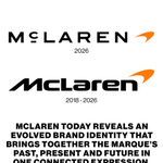
McLaren’s New Identity Connects 60 Years of Racing, Innovation and Ambition
McLaren has revealed an evolved brand identity bringing McLaren Automotive and McLaren Racing together in one connected expression.
Rooted in the vision and restless ambition of founder Bruce McLaren, the new identity looks to McLaren’s past while shaping how the marque presents itself to its clients, colleagues, fans and global community.
Now, McLaren is carrying that spirit forward with a clearer, more unified identity designed to reflect the brand’s continued evolution, growing community and increasingly personalised experiences.
Love to hear your thoughts on this one.
#logodecks

Two Letters, One Line: Inside Maddocks’ Minutes to Midnight Mark.
Frank Maddocks is an American creative director and Warner Records VP of Creative whose work has defined Linkin Park’s look for 25 years. After shaping Hybrid Theory’s stencil-and-soldier packaging, he was asked in 2006–07 to invent a mark that was iconic, memorable, and easy to draw, a stripped, almost punk monogram. The result was the circular LP: L and P locked into a single line inside a broken ring.
That Minutes to Midnight emblem became the band’s visual shorthand and was later stretched into hexagons, open triangles, and the 2024 From Zero circle. Maddocks kept designing with Mike Shinoda across A Thousand Suns, One More Light, and the reunion era, treating the logo as a living system rather than a fixed stamp. The portrait-and-process boards that circulate with his name show how one designer’s restraint turned two letters into one of rock’s most recognizable symbols.
#logodecks

How Otl Aicher Turned Lufthansa Into a Masterclass in Minimalism.
Otl Aicher (1922–1991), a German graphic designer, was renowned for his systematic and minimalist design approach. In 1962, Aicher and his team, including Hans Roericht and Fritz Querengässer, redesigned the Lufthansa logo as part of a comprehensive corporate identity overhaul. The iconic crane emblem, originally created by Otto Firle in 1918, was refined into a sleek, modernist form, a stylized crane within a circle, symbolizing precision and flight. Rendered in Lufthansa’s signature blue and yellow, the logo embodied clarity and reliability. Aicher’s grid-based design system ensured consistency across all branding, cementing Lufthansa’s timeless global identity.
Otl Aicher’s sketches for the Lufthansa logo, developed with his team at the Ulm School of Design in the early 1960s, reveal an evolutionary process blending modernist simplicity with functional symbolism. Initial sketches show the transition from the original 1918 Otto Firle crane to a more abstract form, with some designs exploring a simple arrow to represent aviation’s future, as noted in design commentary. These sketches progressively refined the crane into a stylized silhouette, enclosed in a circle, emphasizing aerodynamics and clarity. Aicher’s process, documented in works like Lufthansa und Graphic Design, highlights his methodical approach, balancing tradition with innovation, though the arrow idea was ultimately set aside for the iconic crane.
#logodecks

Swoosh of the Underground: How Farrow's Rob Petrie Left an Indelible Mark on Acid House.
Designer Rob Petrie created the iconic abstract logo for Liverpool's legendary Cream nightclub in 1993 while working at the design agency Farrow. Tasked by club founders Darren Hughes and James Barton to build a global corporate identity as universally recognizable as the Nike swoosh, Petrie delivered a minimalist masterpiece.
Drawing inspiration from the precision of Japanese automotive and corporate symbols, Petrie meticulously engineered the geometric, interlocking emblem. The entire graphic structure fits perfectly within a matrix of nine invisible circles.The resulting mark became a ubiquitous emblem of 1990s British youth culture, transcending standard club branding. It was immortalised across flyer campaigns, compilations, merchandise, and even clubbers' tattoos.
Petrie’s forward-thinking, industrial geometry stripped dance music away from its gritty, underground aesthetic, repositioning Cream as a sleek, international powerhouse. Decades later, his design remains one of the most celebrated and enduring visual identities in electronic music history.
#logodecks

The Door That Opens From Both Sides.
In 2017, BTS became the first Korean act to win a Billboard Music Award and was named by TIME among the 25 most influential people on the internet. That same year, Korean designer Shin Myungsup and his team at PlusX were brought in to rebuild the group's identity. The name was the first problem: Bangtan Sonyeondan, "Bulletproof Boy Scouts," had been built around defending teenagers from prejudice, and the Korean wordmark read as something else entirely abroad.
Working from producer and member interviews, PlusX redefined the acronym as Beyond The Scene: youth that refuses to settle, stumbling and rising toward something further ahead. The symbol came directly from that sentence. Two angled planes open outward, a door caught mid-swing, with light breaking through the gap.
The clever part is the second mark. ARMY, the group's fandom, was given the same door drawn from the opposite side, seen by those waiting to welcome them through. Placed together, the two symbols close into a single opening. From there the studio proposed carrying the act of opening into every touchpoint: packaging that unfolds like a door, and a concert opening in which an enormous door parts and the members walk out of it.
Recognised at the iF Design Award, the German Design Award, A' Design Award and the IDEA Award, the identity found its real proof elsewhere. Fans began drawing their own versions of the mark, extending a system built to survive constantly changing album concepts.
One door, drawn twice. A symbol that completes only when someone is standing on the other side.
#logodecks

The Quiet Rebrand That Increased BBC Value Perception.
Steffan Cummins, former Creative Director at Wolff Olins, led the BBC’s 2021–22 brand refresh with BBC Creative and the Brand Team, updating the identity for a digital-first world.
The late-’90s three-block logo had become a static legacy mark, unable to keep pace with fragmented platforms. Rather than overhaul it, Cummins refined it, introducing subtle geometric adjustments, more spacing, and renewed use of color, motion, and interaction to ensure it works at any scale.
The update extended into a cohesive set of digital-native icons, including BBC iPlayer, all rooted in the three-block system. As Cummins put it, the goal was coherence, not reinvention, improving consistency and user experience across platforms.
#logodecks

Why the Škoda Logo Looks So Perfect: The Untold Story of Otakar Španiel’s Precision.
Otakar Španiel was a distinguished Czechoslovak sculptor, medallist, and engraver whose artistic precision helped define the visual identity of the young Republic. While the original concept of the "winged arrow" is attributed to commercial director Tomáš Maglič, Španiel is widely believed to be the professional hand that refined the design for its 1923 registration. His expertise in creating relief work and official coinage allowed him to transform the abstract "Indian head" inspiration into a balanced, symmetrical emblem.
This technical refinement ensured the logo remained legible and aesthetically powerful when cast in metal for locomotives and automobiles. By applying his mastery of form to the industrial sector, Španiel bridged the gap between high art and commercial branding. His likely contribution gave the Škoda logo the timeless, geometric quality that allowed it to survive nearly a century of evolution. Although his role remains part of company lore rather than a strictly documented contract, his influence is seen in the logo's transition from a literal sketch to a professional trademark.
#logodecks

The Oval “S” That Still Walks the World.
Albe Steiner, a leading figure in Italian modernist design, created the Superga logo in 1962. Born in 1913 and shaped by Bauhaus principles, he favoured clean typography, precise geometry, and the intelligent use of negative space.
For the Turin footwear brand famous for its classic canvas sneakers, Steiner designed a bold white “S” set inside a simple red or black oval, paired with crisp Helvetica lettering. The result was dynamic yet restrained, perfectly matching Superga’s sporty, everyday character.
Minor updates arrived in 2001 and 2011, but the core form has remained remarkably consistent. Steiner’s mark continues to travel the world on millions of sneakers, proving that quiet, functional design can outlast trends.
#logodecks

The Logo that Started on a Surfboard.
Before Stüssy became a global streetwear icon, Shawn Stussy was a Californian surfer shaping surfboards in the early 1980s.
He began signing his boards with his surname using a broad-tipped marker. That rough, unmistakably personal signature became the foundation of the Stüssy logo. Soon, the same hand-drawn mark appeared on T-shirts and caps, taking it from surfboards into the streets.
Its raw, graffiti-influenced character connected naturally with surf, skate, punk and emerging hip-hop cultures. Unlike many fashion logos designed to look polished and corporate, Stüssy felt like a signature, something made by a person rather than a brand committee. More than four decades later, the logo remains largely unchanged.
#logodecks

The Slash That Defined Banking.
In 1972, German designer Anton Stankowski (1906–1998) won a competition to create a new identity for Deutsche Bank. The result, introduced in 1974, is one of the purest logos in modern corporate design: a blue square cut by a precise 53-degree diagonal slash.
Stankowski, a pioneer of Constructive Graphic Art, distilled complex meaning into absolute simplicity. The stable square represents security and trust. The ascending line symbolizes dynamic growth. Together they form a quiet but powerful statement of progress within solid foundations.
More than fifty years later, the “slash in a square” remains virtually unchanged, a timeless emblem of clarity, discipline, and modernist vision.
#logodecks

The Long “P” That Defined Pirelli.
In 1982, Sicilian-born designer Salvatore Gregorietti refined one of Italy’s most recognisable corporate marks: the Pirelli logo with its distinctive stretched “P.”
Born in Palermo in 1941 and trained in Milan and Zurich, Gregorietti had already collaborated with Massimo Vignelli and Bob Noorda at Unimark International. For Pirelli he took the historic elongated “P”, a form linked to founder Giovanni Battista Pirelli’s signature and the elasticity of rubber, and gave it rigorous modern discipline.
His 1982 identity manual locked in precise letter proportions, spacing, and details for the “R” and “E,” ensuring consistency across every application. The update emphasised speed and stability, perfectly matching a tyre manufacturer’s identity. Later refined in 1997 by Pierluigi Cerri, the mark remained a global constant, even appearing on Inter Milan shirts for more than two decades.
#logodecks

The Red Sun That Redefined the Olympics: Kamekura’s Minimalist Masterpiece.
Yusaku Kamekura’s emblem for the Tokyo 1964 Games is a masterpiece of minimalist modernism that redefined Olympic identity. Unveiled in 1961, the design features a bold red circle representing the Japanese sun, positioned above the five Olympic rings and the "TOKYO 1964" wordmark in gold sans-serif typography.
Kamekura’s use of geometric precision and vibrant symbolism signaled Japan’s post-war re-emergence as a modern, peaceful global power. By eschewing traditional illustrative styles for stark, impactful abstraction, he established a new standard for graphic design, creating an enduring visual legacy that remains one of the most celebrated symbols in sporting history.
#logodecks

The Triangle That Defined Knicks Cool.
In 1992, New York-born designer Michael Doret created the Knicks’ iconic “Triangle” logo for the 1992–93 NBA season. Tasked by the league’s creative director, he modernised the team’s 1960s identity with bold Art Deco energy that echoed the city’s architecture.
His dynamic “Knicks” wordmark sits above an inverted triangle, incorporating interlocking “N” and “Y” forms that evoke both unity and the team’s “knickerbocker” roots. Early sketches included the Empire State Building, but licensing issues led to its removal. A secondary monogram inspired by New York subway tokens appeared on uniforms and merchandise. In 1995 he added the elegant “New York” arc, completing the sleek metallic look still used today.
Raised in Alphabet City, Doret poured urban nostalgia into every letter. In 2024 he even revisited unused 1991 sketches with Kith for a special apparel collection.
#logodecks @nyknicks

The Armature That Became a Global Emblem.
In 1918, Gottlob Honold, Bosch’s brilliant chief engineer, designed one of the most enduring industrial logos in history.
Drawing directly from his own technical mastery, he based the mark on a cross-section of the magneto’s double-T armature, the device he had perfected to revolutionise engine ignition. A physical model of that armature sat on his desk as a paperweight and served as the visual blueprint.
The resulting armature in a circle is clean, geometric, and instantly recognisable. It symbolised the precision engineering and electrical innovation that powered Bosch’s early success. More than a century later, Honold’s simple industrial form remains the company’s global signature.
#logodecks

How One Designer Changed the Face of South Korean Business.
Myung Kwang Kwon, a visionary in South Korean graphic design, revolutionised the country’s corporate landscape through his strategic approach to visual identity. As a professor and president of Hongik University, Kwon moved beyond mere decoration, treating design as a vital business asset.
His 1970s Corporate Identity for Cho Hung Bank remains a hallmark of this philosophy. Tasked with modernising Korea's oldest financial institution, Kwon replaced traditional, stagnant imagery with a bold, geometric symbol that balanced heritage with forward-looking stability.
The logo’s clean lines and structured composition reflected a new era of professionalism in the Korean banking sector. By distilling complex institutional values into a singular, memorable mark, Kwon’s work for Cho Hung Bank helped set the standard for modern CI systems across East Asia.
#logodecks

From Quirky Plaid to Professional Octothorpe.
In 2019, Pentagram partner Michael Bierut led a high-stakes redesign of Slack’s visual identity. The original multi-coloured “plaid” hashtag was beloved for its personality but notoriously difficult to reproduce, eleven colours that often failed on different backgrounds.
Bierut and his team replaced it with a cleaner “octothorpe” built from four speech-bubble shapes and four lozenges. The new mark was more disciplined, scalable, and professional, better suited to a global platform.
The reaction was immediate and vocal. Critics called it a pinwheel or a medical logo and mourned the loss of Slack’s quirky charm. Bierut defended the change as necessary evolution: a brand growing up without losing its core identity.
#logodecks

The Forgotten German Caricaturist Behind One of the World’s Most Famous Logos.
Lutz Backes, a talented German caricaturist often known by his pen name Bubec, is the mastermind behind one of the most recognisable symbols in sports history: the Puma leaping cat. In 1967, his former schoolmate Gerd Dassler, son of the company’s founder, asked him to modernise the brand's identity. Backes sketched a minimalist, powerful silhouette of a predator in mid-leap. Interestingly, he used a black panther as his visual reference rather than a puma, believing the panther’s leaner frame offered a more elegant and dynamic aesthetic for a sportswear brand.
Despite the logo's eventual global success, Backes famously missed out on a massive fortune. When offered a royalty of one pfennig per item sold, he declined, preferring a flat fee. He instead accepted a one-time payment of 600 Marks, along with a sports bag and a pair of running shoes. His design officially debuted on the world stage at the 1968 Olympic Games in Mexico City. Today, the leaping cat remains virtually unchanged, serving as a testament to the timelessness of Backes’s clean, athletic vision.
#logodecks
