

Exploring the endless possibilities of Web 3.0 || 🌐💡 | Web3 UI/UX & Brand Identity Designer . Cofounder, The Creative Vault | Building Startup
earth
Joined February 2023
- Tweets249
- Following301
- Followers45
- Likes289






Pinned Tweet
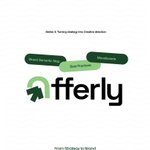
From strategy to Execution. SERIES 1/5.
Before designing Offerly, I had to understand the business first.
Who are we?
Who are we building for?
What problem are we solving?
Where are the gaps?
And what opportunity can the brand own?
Here’s the strategy behind the brand 🧵

Iam_Zay retweeted

OMG just hire a designer, what an embarrassment.
Dear founders, let this be a very good example of how NOT to do it.
Invest in your look if you don't wanna look like someone trying to save $40K - $50K while running a million dollar company. Pathetic. 💀


I feel like we’re so focused on where we want to be that we forget to appreciate who we’re becoming.
It’s just a couple of days until the end of the year. There’s still a lot to learn, build, and figure out.
Give yourself some grace, pal. You’re still growing.


A strategy is one thing. Making people feel it is another.
I had the direction. Now, I had to turn it into a visual identity that felt like Offerly.
From the logo to the colours, typography, and imagery, here's how I brought it to life.


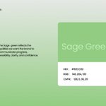
Colour was one of the decisions I wanted to get right.
For Offerly, I chose a palette that reflects progress, possibility, and confidence while keeping the brand clear, modern, and approachable.


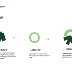
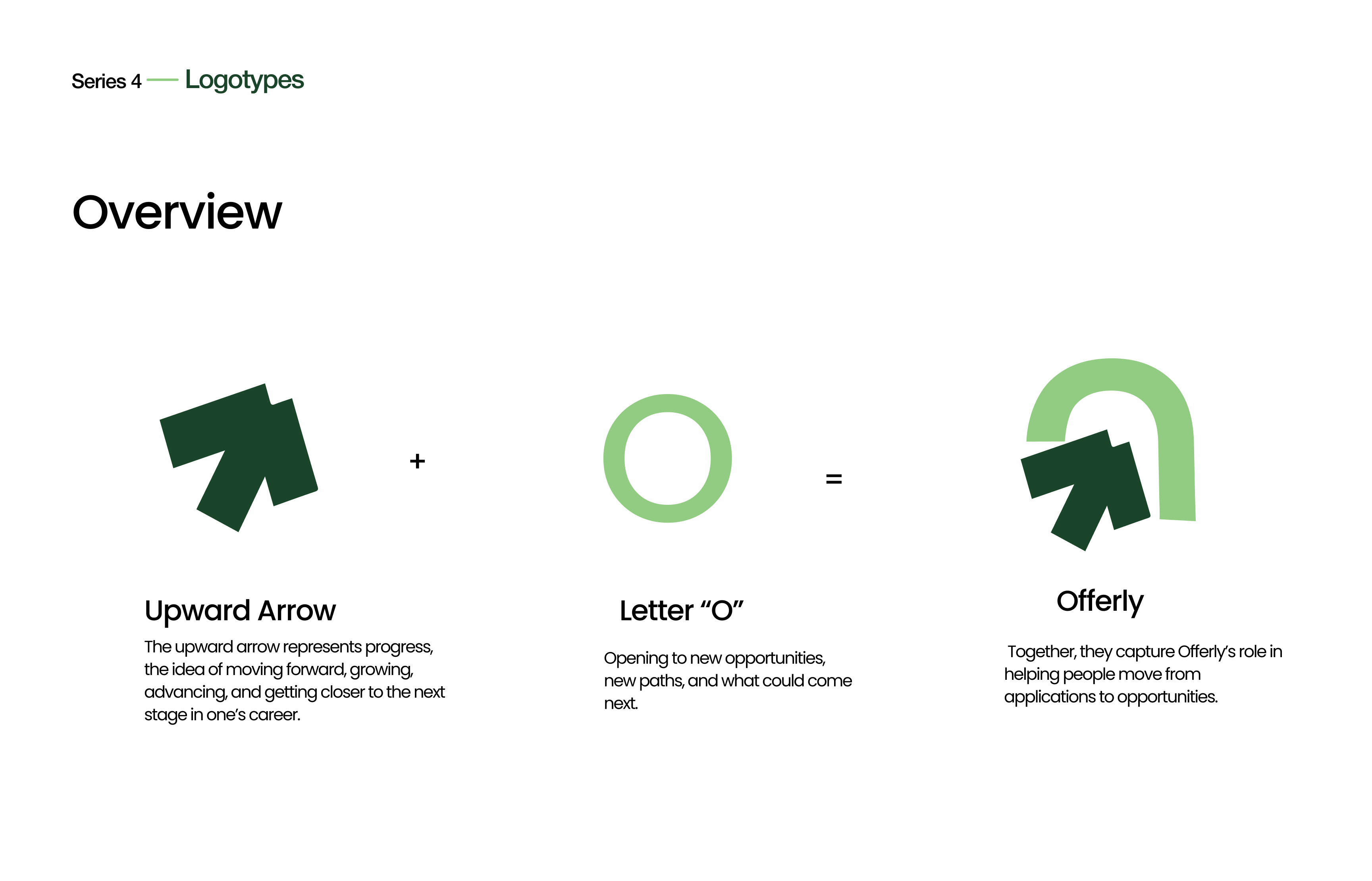
A logo isn't just a symbol. It needs to work wherever the brand shows up.
For Offerly, I explored how the primary and secondary logo would support different layouts and touchpoints while keeping the identity consistent.
Here's how I approached the logo system.


From Strategy to Execution. SERIES 3/5.
The strategy gave me the foundation. Next was figuring out how all of it could translate into a visual direction for Offerly.
This is where the brand started taking shape.

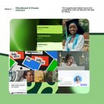
With a clearer direction in place, I started exploring how everything could come together visually.
The moodboards helped narrow the possibilities until one direction felt right for Offerly.
That direction became the foundation for what came next.

From Strategy to Execution. SERIES 2/5
Understanding the business gave me the direction.
Now I had to define what Offerly should stand for, what it should promise, and the principles that should guide the brand. Before designing how Offerly looks, I needed to define what it means
Once the positioning and promise were clear, I needed to define what Offerly should stand for.
Not just how it should look, but the principles that should guide the product and the brand.
Clarity. Intelligence. Progress. Empowerment. Humanity.
