

Turning 46,000+ iOS paywalls into subscription insights.Helping devs, PMs & designers monetize smarter.
Joined July 2025
- Tweets890
- Following416
- Followers343
- Likes227




Pinned Tweet
Building better paywalls starts with seeing more than your own app.
PaywallPro is a growing library of real onboarding & paywall designs from top apps across categories.
Built for UI/UX designers, product managers, and developers who care about conversion, pricing, and user psychology.
If you’re designing, shipping, or optimizing subscriptions, this is for you.
Let’s learn from real patterns, not guesses.
👉 Follow PaywallPro
🤝 Let’s connect.

ShutEye doesn’t sell sleep tracking.
It sells the feeling of finally waking up refreshed. 🌙
Their onboarding flow:
→ Identify your sleep problems
→ Collect sleep goals & habits
→ Generate a personalized sleep score
→ Preview AI-powered insights
→ Convert users with a tailored sleep plan
The key lesson:
Great onboarding doesn’t explain features.
It makes users believe the product understands them.
Most period tracker apps ask for your cycle.
This one sells certainty.
After analyzing the onboarding of Period Tracker Period Calendar, one thing stood out:
It transforms a simple tracking app into a personalized health assistant before showing the paywall.
Here's how:
→ It starts with familiar questions.
Users enter their cycle length, period dates, and goals, creating instant personalization with minimal effort.
→ It expands the value beyond tracking.
The onboarding introduces ovulation prediction, pregnancy insights, symptom logging, reminders, and health reports—positioning the app as a daily companion, not just a calendar.
→ It visualizes the outcome.
Instead of listing features, users see forecasts, calendars, and personalized reports, making the benefits tangible before they're asked to pay.
→ It stacks perceived value before monetization.
By the time the paywall appears, users have already seen multiple premium use cases instead of just one core feature.
The paywall then lowers purchase friction with:
• A free trial
• Large discount messaging (up to 70% off)
• Benefit-focused premium cards
• A clear comparison between free and premium
The biggest takeaway?
People don't subscribe to track periods.
They subscribe to better understand what's happening with their bodies.
The best onboarding doesn't sell features—it helps users picture a better future before they ever reach the paywall.
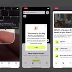
Most food allergy apps sell ingredient scanning.
Fig sells peace of mind.
And that's exactly why its paywall feels justified.
Here's what Fig gets right before asking users to subscribe:
→ It starts with safety, not features.
The first screen emphasizes that your health comes first, immediately building trust for a high-risk use case.
→ It demonstrates the product instead of explaining it.
Users see barcode scanning in action within seconds, making the value obvious before any payment request.
→ It expands the value proposition.
The onboarding introduces Restaurant Mode, showing that Fig isn't just for grocery shopping—it helps you eat safely anywhere.
→ It asks for lightweight personalization.
Instead of lengthy questionnaires, users simply pick a favorite restaurant type, creating a sense of relevance with minimal effort.
Only then does the paywall appear.
And even the paywall continues reducing friction:
• 7-day free trial is preselected
• "No payment now" removes immediate purchase anxiety
• Trial reminder is enabled by default, addressing a common cancellation concern
• "Cancel anytime" reinforces flexibility
The result?
The paywall doesn't interrupt the experience.
It feels like the natural next step after users already understand the product's value.
Great subscription apps don't convince users at the paywall.
They make the paywall feel inevitable through onboarding.

Most fitness apps start by asking what you want to achieve.
Bend: Stretching & Flexibility starts by asking who you are.
Before recommending a plan, it asks about your age, activity level, flexibility, pain points, and daily routine.
It feels less like filling out a form and more like talking to a physical therapist.
That design choice builds trust before asking for commitment.
When users believe the program is tailored to their body—not just their goal—they're much more likely to follow through.
Takeaway: Personalization isn't just about better recommendations. It's about making users feel understood from the very first screen.
Most apps try to make onboarding as short as possible.
Simple does the opposite.
Its onboarding takes 20+ screens, yet it never feels long.
The reason?
Every question feels like it's creating your personalized weight-loss plan—not collecting data.
That small UX shift taps into the IKEA Effect: people value something more when they've invested effort into building it.
You're not completing a questionnaire.
You're investing in your plan.
That's what makes users stick around.
Why does Fitbit ask so many questions before showing the app?
Because every answer increases commitment.
Fitbit's onboarding follows a simple formula:
Goal → Personalization → Commitment → Product
Users are asked:
• What they want to achieve
• Their body metrics
• Activity preferences
• Lifestyle habits
Each step makes the experience feel more personal.
By the end, Fitbit isn't just another fitness tracker.
It feels like a coach that already understands you.
That's what great onboarding does:
It turns setup friction into emotional investment.
Nobody wakes up wanting a workout plan.
They wake up wanting a different body.
Mad Muscles understands this better than most fitness apps.
Its onboarding isn't about exercises.
It's about transformation.
👇
→ Shows body types before workouts
→ Asks users to select their desired physique
→ Builds a personalized fitness profile
→ Estimates potential results
→ Creates a clear before-and-after narrative
Most fitness apps sell features:
Calories.
Workouts.
Training programs.
Mad Muscles sells a future identity.
And that's why onboarding feels so persuasive.
People don't buy workouts.
They buy outcomes.
"What rank am I?"
That's the question Liftoff's onboarding is built around.
Not:
❌ What's your goal?
❌ How often do you train?
❌ Which workout plan do you want?
Instead, it taps into something much stronger:
Ego.
The flow quickly gathers your gym stats, estimates your strength level, and shows where you stand relative to others.
Why it works:
→ Competition creates instant engagement
→ Rankings make progress tangible
→ Future ranks create aspiration
→ Identity is more motivating than features
Most fitness apps sell training.
Liftoff sells status.
And status is one of the strongest growth loops in consumer products.
BitePal doesn't sell calorie tracking.
It sells a pet you don't want to disappoint.
Most calorie-tracking apps focus on numbers:
Calories.
Macros.
Weight goals.
BitePal takes a different approach.
It turns nutrition into a virtual pet game.
Here's what makes the onboarding interesting:
→ Food logging is introduced through AI photo scanning
→ Nutrition feedback feels instant and effortless
→ Users are given a virtual raccoon companion
→ The pet is personalized with a custom name
→ Reminders become "helping your pet" rather than app notifications
This is a subtle but powerful shift.
Most health apps rely on discipline.
BitePal relies on emotional attachment.
As onboarding continues, users enter a familiar health funnel:
• Activity level
• Height
• Weight
• Goals
• Personalized recommendations
But the raccoon remains the central character throughout the journey.
That changes how users perceive the product.
They're not just tracking calories.
They're taking care of something.
By the time BitePal generates a personalized nutrition plan, the app has already established:
A health goal
A progress expectation
An emotional connection
That's a much stronger foundation for retention than calories alone.
One lesson for subscription apps:
Features create utility.
Characters create attachment.
BitePal combines AI food tracking with virtual pet mechanics to make a category that often feels stressful feel surprisingly playful.
And that may be its biggest onboarding advantage.
Open Paywall Gallery just expanded from 500 to 550 iOS subscription apps.
This week’s update adds 50 new paywall and onboarding examples across:
• Photo & Video
• Education
• Utilities
• Productivity
• Social Networking
• Health & Fitness
• Sports
New apps include Photo Lab, Airbrush, PixVerse, OpusClip, CamScanner, Fantastical, Brilliant, codeSpark, Fender Play, Truecaller, and more.
We’ll keep adding 50 new apps every week.
Explore the repo:
github.com/paywallpro/paywal…

Liven doesn't onboard users.
It diagnoses them.
Before showing features, before asking for payment, before talking about benefits—
Liven asks users to answer a long series of personal questions.
At first, it feels like a personality quiz.
But it's actually a carefully designed conversion funnel.
Here's what makes it interesting:
→ Users invest time before seeing results
→ Every answer increases psychological commitment
→ Progress indicators reduce onboarding fatigue
→ Curiosity builds with every completed step
Most apps try to prove their value.
Liven makes users discover it themselves.
The onboarding focuses on:
• Habits
• Emotions
• Behaviors
• Personal challenges
• Life satisfaction
As users move through the flow, something important happens:
They're no longer evaluating the app.
They're evaluating themselves.
And that's a powerful shift.
By the time the personalized results appear, users have already invested effort, attention, and emotion into the process.
The paywall arrives at exactly the right moment.
Because it isn't selling features.
It's selling answers.
One of the biggest onboarding lessons here:
The highest-converting subscription funnels often don't start with product education.
They start with self-discovery.
Liven turns curiosity about yourself into motivation to subscribe.
That's what makes this funnel so effective.
Most translation apps start by showing features.
iTranslate starts by qualifying the user.
The first real onboarding question is:
“Are you here for a one-time translation?”
That single question does two things:
Segments user intent immediately
Prepares different monetization paths later
Then the app introduces its core features:
• Text Translation
• Camera Translation
• Voice Translation
Notice what’s missing:
No language selection.
No account creation.
No lengthy setup.
The onboarding stays focused on one goal:
Show value before asking for commitment.
A few things I like:
→ Intent segmentation happens before feature education
→ Each screen highlights a distinct use case
→ Visuals make features understandable without reading
→ Low-friction flow with a clear “Continue” CTA
The lesson:
Many apps use onboarding to explain everything.
iTranslate uses onboarding to answer one question:
“What job did this user come here to do?”
That mindset often leads to better activation and better monetization.
Great onboarding isn't about teaching users your app. It's about understanding why they came. 🚀
Most period tracking apps ask for your cycle.
Stardust asks for your birth time.
That single onboarding decision changes everything.
Instead of feeling like a health tracker, Stardust feels like a personal discovery experience.
The flow collects:
• Birth date & time
• Cycle length
• Period duration
• Personal health data
But here's the clever part:
Users don't feel like they're filling out forms.
They feel like they're unlocking personalized insights.
By the time they reach the paywall, they've already invested effort and seen value.
A few lessons:
→ Sell curiosity before features
→ Make data collection feel meaningful
→ Deliver insights before asking for payment
→ Keep the paywall consistent with the onboarding story
Many period trackers sell tracking.
Stardust sells self-understanding.
We built this to make subscription app research more open and structured.
Instead of isolated screenshots, the dataset includes onboarding flows, pricing structures, paywall patterns, and benchmark data in a machine-readable format.
We’ll continue expanding the library every week.

We just open-sourced a public dataset of 500 top iOS subscription app paywalls and onboarding flows.
It includes:
• paywall screenshots
• onboarding previews
• pricing models
• paywall patterns
• MRR / ARPU / RPD benchmarks
• machine-readable Markdown data
Built from PaywallPro’s subscription intelligence database.
Useful for app developers, product managers, growth teams, and designers studying subscription monetization.
We’ll add 50 more apps every week.
Star the repo here:
github.com/paywallpro/paywal…

Most fitness apps waste onboarding trying to “motivate” users.
Hevy - Workout Tracker Gym Log does the opposite.
No inspirational quotes.
No long fitness quiz.
No fake personalization.
They push users into the core loop immediately:
Log workout → track progress → come back tomorrow.
Even the paywall placement is strategic.
It only appears after:
Apple Health connection
unit selection
workout context
By then, the user already feels invested.
Smart onboarding isn’t about collecting information.
It’s about accelerating habit formation.
One of the smartest onboarding patterns in Habit Tracker is the use of an “I Promise” step.
Rather than simply asking users to select goals, the flow creates a small psychological commitment early in the journey. Combined with multiple affirmation-based interactions, it builds momentum before users even reach the paywall.
This makes the subscription screen feel less disruptive — and more like a continuation of the commitment users have already made.
#Onboarding #BehavioralPsychology #PaywallStrategy #ProductDesign
Habit Tracker’s onboarding starts with user frustrations:
procrastination, inconsistency, lack of motivation.
This approach does more than collect preferences — it creates emotional alignment.
By visualizing a “before vs after” transformation throughout the onboarding flow, the product positions premium features as tools for personal progress, not just additional functionality.
#UXDesign #EmotionalDesign #GrowthDesign #SubscriptionApps
Habit Tracker reinforces its value proposition through concepts like “The Science of Habits” and progress-based happiness graphs.
This shifts the product positioning from a simple habit tracker to a structured system for long-term self-improvement.
When onboarding connects product usage with measurable personal growth, premium conversion becomes easier to justify.
#ProductLedGrowth #WellbeingTech #AppGrowth #Onboarding
Opal doesn't just show daily screen time; it projects a lifetime of lost years (e.g., "22 years looking down at your phone"). This powerful emotional hook creates instant pain awareness, making their solution feel indispensable. A masterclass in problem framing!
#Opal #ScreenTime #Onboarding #PaywallStrategy
Why settle for daily metrics when you can show life-altering impact? Opal's use of lifetime screen time projections is a game-changer for utility apps. It transforms a simple problem into a profound opportunity, making the premium features feel truly valuable. #DataVisualization #Opal #ProductStrategy #AppMarketing
Opal understands users have different commitment levels. By offering a choice between a 7-day free trial and a discounted 30-day trial, they cater to a broader audience, increasing the likelihood of conversion. Smart paywall design meets user choice. #PaywallDesign #Opal #SubscriptionApps #UserExperience