

22 bi he/she | Former top 500 GD Player now reviewer | Request form and more in link | pfp by @FutonSecret banner by @xmysticgfx
Sydney
Joined February 2019
- Tweets11.8K
- Following77
- Followers4.3K
- Likes51K




Pinned Tweet
I've opened nominations for my GD Best of 2026 video!
Submit any level you think may be featured in the video. More info can be found in the form, first link in the linktree. Please submit as much as you'd like :)
linktr.ee/shoeyreviews

been trying to stay ahead on this video because there is so much that goes into it and yeah its impossible ive got 150+ levels in contention for a 50 level video BUT i do have a 50 now (i think) so will see what comes out in the next month before i close the window for the year

I've opened nominations for my GD Best of 2026 video!
Submit any level you think may be featured in the video. More info can be found in the form, first link in the linktree. Please submit as much as you'd like :)
linktr.ee/shoeyreviews
no level has ever replicated the feeling of passing enlex from 0 for the first time for me. the way people spoke about any enlex part in 2019 was different. om guille dual from 0 is the only thing that comes close imo
also the update ruined the ending make it blind again 🙏


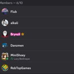
lore drop the group chat is from like 2020-2021 not too long before the gds robtop call. it was all of us minus rob in a gds call that got out of hand so we moved into a group call and then i think alkali made a joke about adding rob to the call (he was chatting in general at the time) and then he actually joined and hung out for like an hour😭
i think i was asked if i wanted to be mod at the end of the call and my highly intelligent ass said no (i was actively going for it at the time)
we never revealed this gc because we thought that if viprin or pauze found out they would lose their shit and given that alkali and i think dan was mod at the time its probably a fair assessment so ig that kinda shows how long they have been this way...

BEST OF 2026 NOMINATIONS: forms.gle/Qjr6XdpW3s4ykJeGA
[REVIEW 167] jimmy donaldson by Extreme0 (148745133)
jimmy donaldson is a fast paced, bright design level with a few art elements thrown in the mix. I find there's a lot of small things in this level that give it a fleeting feeling.
To talk about this fleeting feeling, the aspects of the level that give off this vibe include the rushing clouds and speed lines, constant motion with area effects, sawblades, and particles, and the use of the tops of large structures in the background to further emphasise a sense of elevation. This is then of course all topped off with very fast paced gameplay. I think Extreme0 has done a great job in blending all these things together without it feeling overbearing as the level still feels relaxed enough to match the energy of the song especially outside of the drums. I also like the choice of blocks in each part. Despite the simplicity of the block designs, going from grass for the ground predrop, grids for the cell towers, and bricks for the castle are all brilliant touches. The larger black structures scattered throughout each part are also nice breaks from what would be quite monotonous deco and I think they do great in grounding the player.
Honestly there isn't much I'd change about this level. I think the area moves do the job but I think it would've been nice to see entire structures moving, especially in the castle section, as it would make the parts feel more dynamic. I think the pulses in this level are a touch too weak, some experimentation with object colour would do just enough in adding that missing intensity. I think gameplay wise I would've like to see the vocal chops implemented into the level a bit as I think it could create an interesting scenario where the player can predictably reset a click pattern. I also don't like the invisible hitboxes in wave parts that revolve around sawblades.
Overall it's a pretty solid level that uses the song quite well to create a beautiful yet intense atmosphere. Despite this there are still moments across the whole level that undersell the song a tad. I would consider this a high star rate low feature.
Higher quality showcase: youtu.be/VkHVqa42Db0
Level Requests and more: linktr.ee/shoeyreviews
Occasional level request streams: twitch.tv/minishoey


This whole advisor thing seems odd but will have to wait and see what changes Rob is alluding to in 2.209. I'm still planning on continuing doing what I was already doing in terms of reviews
BEST OF 2026 NOMINATIONS: forms.gle/Qjr6XdpW3s4ykJeGA
[REVIEW 166] L1FE by polir56 (143778332)
L1FE by polir56 is a level I was requested on stream the other night and I thought I'd have another look at it. The level is quite simple but is well styled with it being quite reminiscent of your average capcut edit.
I absolutely adore the colours in this level as they pop out pretty much perfectly even in parts that are for the most part monochrome without shaders. I also like how organic elements mix with the more "industrial" elements of the structures. It's a nice little bit of theming that takes the level a little beyond a regular design level.
I think the shaders in the part at 0:39 are little too strong for my liking. While the shader intensity is barely any higher than the previous parts, the monochrome nature of this part makes it difficult to make out what the gameplay is, especially when dealing with super flat spikes and I think the effect would be better pulled off with higher contrast between the foreground and background either through hue or brightness as seen in previous parts. I also think the structuring takes a bit of a dive in the latter parts of the level especially at 0:47 where obvious evenly spaced columns are formed. I find it just makes the part feel quite uninteresting given the much better placement of structures in the earlier parts.
Overall it's a decent level but I do think a couple sliders are tuned a little too harshly and that's about it. I would've liked to see a bit more length on this one as well. I can see this getting rated maybe featured.
Higher quality showcase: youtu.be/KF-2kuVraj8
Level Requests and more: linktr.ee/shoeyreviews
Occasional level request streams: twitch.tv/minishoey
Firework in 4 runs now yay! Quite productive for stream 3 I think with me finally getting the first drop in a run. Hopefully get 45-100 in the coming days :)
BEST OF 2026 NOMINATIONS: forms.gle/Qjr6XdpW3s4ykJeGA
[REVIEW 165] Caesium by Frigloo (143738699)
Caesium by Frigloo is a level requested to me on stream (link in the linktree) so this review is essentially a recap of what I had to say about the level. The level is a pretty standard design level, but I think there's a few choices regarding the composition of the level which hold it back.
To start I think the level feels quite disconnected from the background where the level is just comprised of the foreground bits and the background. While a custom background would help bring the two together, I actually think the problem starts with the way air deco is used particularly in the first part. The air deco does successfully fill in what would be empty space but it does end up just feeling like a part of the foreground. In the following section at 0:11 we can see larger objects on the floor and ceiling of the level. These objects feel as if they blend the background and foreground together really well because of their scale. I think implementing these kinds of large scale, faint objects behind the foreground (without any movement to suggest a custom bg) does a lot in merging the foreground and background together to make a cohesive visual experience. Similar things about larger assets to merge the level can be seen in the drop at 0:37.
I think the drop at 0:37 does some nice things with how it represents the song. Having the camera be free, the movements be open and the player size be big for when the lead melody is bright adds a nice level of contrast to the restricted camera and gameplay of the darker melody. I think this idea could've been expanded further though as I think focusing on slope based structures for the open parts would complement the free flowing gameplay. I say this because this kind of gameplay is present very briefly at the start of the drop but quickly takes a back seat.
I think the camera at 0:25 could do with some work. The deco concept for the part is neat with the top and bottom half having different colours and swapping between each other but the low camera makes it difficult for this to really be seen. I think using a custom camera so that the player generally stays in the center of the screen on the y axis would do plenty emphasising the effect more.
Overall it's still a decent level and I can see how Frigloo can improve in their later projects. The gameplay admittedly did feel a little bit finnicky but it's ultimately things that can be fixed in playtesting so no big dramas. I can maybe see this level getting rated.
Higher quality showcase: youtu.be/KF15SQag6r8
Level Requests and more: linktr.ee/shoeyreviews
Occasional level request streams: twitch.tv/minishoey
Trying to go for 10 consecutive years of list points and I don't think The Golden is staying on for another 2 ish years so I'm grinding again.
All this from stream 1 and an extra hour off stream. Learnt everything except the first part now.
BEST OF 2026 NOMINATIONS: forms.gle/Qjr6XdpW3s4ykJeGA
[REVIEW 164] NX ESCAPES by nokotiro (147103399, @noctil89)
NX ESCAPES by nokotiro is a sort of factory themed level that has flashes of brilliance, particularly in structuring, but suffers from going overboard on certain effects and design choices where the importance of intention shows itself.
Without thinking too hard on the composition, the level looks great, most notably at 0:53 where separation between layers is clean and the blue highlights do a great job in making the level readable. The flickering pulses on some of the spikes add a nice amount of energy to the part without it going too overboard. The same things can be said about the flickering in the ending section. It is clear that nokotiro understands how to use these kinds of pulses to add ambient energy to a part.
I think a lot of my problems with this level stems from it sometimes feels like it's trying to combine a whole bunch of features that exist in good levels without considering why those features exist in the first place. The level quite often switches the aspect ratio, and while it is true that going from a narrow to a wide aspect ratio does wonders in emphasising intensity in the song, I don't see it executed very well in this level. Introducing 4:3 in the second part when the song hasn't changed a whole lot from the first makes the implementation feel clunky. Adjusting the ratio to a wider ratio before the drop occurs lessens the impact of the drop and in a way ruins the built up suspense the narrow ratio developed. I think you could argue the level should stay in 4:3 all the way up to 1:13 where the impact frame can easily justify an expansion of the viewable area. The camera UI and some of the sound effect usage are also things I'd consider to be weak points in the level as they either don't appear to really serve a purpose besides "looking cool" or they're sloppily implemented.
I quite like how the white player overlay is handled in the intense sections of the level as it's justified by the appearance of a UI element exclusive to that effect as well as darkening the surrounding environment to make the player stand out more. I think it would've been nice to see elements of the UI in the final part, perhaps in the block design, as it would link the use of the overlay in this part to the previous parts (I think just using the overlay here wouldn't look great).
Overall the level is decent, I just can't help but feel that some of the effects used weren't fully considered or used to the maximum potential which is quite disappointing. It's clear though that nokotiro does know what they're doing on a raw visual standpoint and can clearly see a path to significantly better levels. I can see this level getting featured.
Higher quality showcase: youtu.be/nq7iUwwW8kc
Level Requests and more: linktr.ee/shoeyreviews
Occasional level request streams: twitch.tv/minishoey
BEST OF 2026 NOMINATIONS: forms.gle/Qjr6XdpW3s4ykJeGA
[REVIEW 163] Voyager 1 by oliverbum (126489445, @oliverbumm)
Voyager 1 by oliverbum and more is a mostly 2.0 megacollab very much inspired by the time. There are a few things in this level that do stray away from this and while I normally like the idea of making old styles with the lessons of modern creating, mixing the two design philosophies can lead to a level losing its identity.
I think the level feeling as if it loses its identity in parts is the main shortfall of this project. This is most obvious with the foreground effects in a select few parts which is something you basically never saw in 2.0 outside of tacky UI elements. What I'm talking about shows up at and . On there own they are cool effects, but they feel inauthentic compared to other parts in the level that more faithfully recreate the vibe of 2.0. I mentioned earlier that this level is mostly 2.0 and while nitpicky, I'm 99% sure the swirl object used in is from 2.1.
Aside from the few parts I mentioned, I really like how the majority of this collab catches the essence of 2.0, from the deco transitions that make basically zero sense to the random tech part that everyone will fall in love with at . The use of duals, song choice, and memory also help elevate this feeling. I would've liked to see duals used for longer durations though.
Overall it's a really well put together level and I'll pretty much always love seeing modern interpretations of 2.0. I think the feature rating is quite deserved and if the level was able to slightly closer mimic the essence of 2.0 I could've seen this get epic.
Higher quality showcase: youtu.be/WoszoHS9Y8g
Level Requests and more: linktr.ee/shoeyreviews
Occasional level request streams: twitch.tv/minishoey