

Design consulting firm based in Tokyo.
Tokyo
Joined March 2022
- Tweets168
- Following247
- Followers2.6K
- Likes468




Pinned Tweet
企業の独自性を活かしたコミュニケーション設計を軸に取り組むSitoh inc.は、ブランド戦略・ビジュアルアイデンティティ構築・コミュニケーションデザインまで一貫した伴走を強化し、継続的なアップデートを重ねてきました。
現在は、AI事業・ロボット事業・宿泊業・スキンケア事業・スポーツ事業・住宅事業など多様な領域のブランド構築に携わっています。
実績の詳細はプロフィールよりご覧ください。
⸻
Grounded in communication design that brings out each company’s unique identity, we have strengthened our consistent partnership across brand strategy, visual identity development, and communication design while continuously evolving our approach.
Currently, we are engaged in brand development across diverse sectors, including AI, robotics, hospitality, skincare, sports, and residential industries.
For more details on our work, please visit our profile.
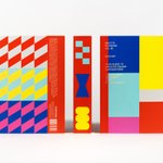
マルマン @maruman_sketch の新しいライフスタイルブランド「SOUZO by maruman」のブランドアイデンティティと、第1弾商品ラインナップの一つである専用ケース付きノート「Essence Journal」のパッケージデザインをSitoh inc.で行いました。
ブランド名の「SOUZO」は、「想像」と「創造」という二つの言葉に由来しています。ブランドの核となる「未完成の美しさ」を起点に、余白や感性の広がり、使い手とともに育っていくブランドのあり方を、アイデンティティとしてロゴ設計しました。
ブランドロゴは、文字の一部を欠損させることで「未完成」を表現。中央に生まれる四角い余白は、マルマンを象徴するノートのかたちに見立てています。


We developed the brand identity for Maruman’s new lifestyle brand, “SOUZO by maruman,” as well as the packaging for “Essence Journal,” a notebook with a custom-designed case from the brand’s first product collection.
The name “SOUZO” comes from two Japanese words with the same pronunciation: sōzō, meaning “imagination,” and sōzō, meaning “creation.” Guided by the brand’s central concept, “the beauty of incompleteness,” we created an identity that expresses a sense of openness, the freedom to explore one’s sensibilities, and the idea of a brand that grows together with its users.
The brand logo expresses “incompleteness” through deliberately omitted sections of the letterforms. The square-shaped negative space at its center is designed to evoke the form of a notebook, a symbol of Maruman.
art direction, design: @motoi_shito (Sitoh inc.)
motion design: Motoi Furuya (Sitoh inc.)


香港のSandu Publishingから出版された「Graphic Design Rules」にマルマン創業100周年の際にデザインした「spiral note」が掲載されました。behance.net/gallery/24905863…


イギリスのCounter-Printから出版された「Expressive Type Today」にför äggのリブランディングが掲載されました。counter-print.co.uk/products…


イギリスのCounter-Printから出版された「Unboxed: Japan」に石田珈琲やHocus Pocusのパッケージデザインが掲載されました。counter-print.co.uk/products…


香港のvictionaryから出版された「Palette Playbook Vol.01 Radiant」にマルマン創業100周年の際にデザインした「spiral note」が掲載されました。victionary.com/collections/a…

写真家 丸尾和穂さんの名刺デザインを行いました。お名前に含まれる「丸」をモチーフに、名刺の矩形と組み合わせることで、カメラに見立てたデザインとしています。
タイポグラフィーでは、撮影される被写体だけでなく、その周辺にある空間までも包み込む写真の特徴に加え、丸尾さんが写し出す自然の佇まいや揺らぎを、文字の配置によって表現しました。
We designed a business card for photographer Kazuho Maruo. Using the circle implied by the kanji character “Maru” in her name as a motif, we combined it with the rectangular form of the card to create a camera-like composition.
In the typography, the design reflects not only the photographed subject but also the surrounding space that embraces it, as well as the quiet presence and subtle sense of movement found in the natural scenes Maruo captures―expressed through the placement of text.


長岡亮介さんがナビゲーターを務めるJ-WAVEの番組「CITROËN FOURGONNETTE」の世界観をまとめた小さな冊子「フルゴネット パピエ」のエディトリアルデザインをSitoh inc.で行いました。季節ごとの番組エピソードや素敵なイラストは、ぜひ実物を手に取ってご覧ください。
A small booklet titled Fourgonnette Papier captures the world of the J-WAVE radio program CITROËN FOURGONNETTE, hosted by Ryosuke Nagaoka. With editorial design by Sitoh inc., the booklet features seasonal episodes and delightful illustrations—something best enjoyed by holding it in your hands.
creative direction: Polar Inc.
illustration: Taiki Yamanaka
photography: Mitsugu Uehara


堅牢なデザイン性と先進技術でキッチンの常識を超えることに挑むリンナイのフラッグシップカテゴリー「G:LINE」。公式Instagramアカウントの刷新に伴い、リサーチ・投稿計画の全体設計から各種ディレクション・デザインまでをSitoh inc.が行いました。
Rinnai’s flagship category “G:LINE” challenges conventional kitchen norms with robust design and advanced technology. With the renewal of its official Instagram account, we were responsible for everything from research and content planning to overall direction and design. To more vividly convey the brand’s worldview, we integrated the functional beauty of the products with refined lifestyle scenes, creating touchpoints expressed through visuals that are both minimal and powerful.
art direction, planning: @motoi_shito (Sitoh inc.)
research: Johnny Hu (ex-Sitoh inc.)
motion design: Motoi Furuya (Sitoh inc.)
produce, cgi, copywriting: amana inc.
BehanceにTriOrbの実績を追加しました。behance.net/gallery/23674500…

アートディレクションとデザインを担当した「stiiilll」が2025年度グッドデザイン賞を受賞しました。


未踏事業は、独立行政法人情報処理推進機構(IPA)が実施する、突出したIT人材の発掘・育成を目的とした国家プロジェクト。産業界や学術界で活躍するプロジェクトマネージャー(PM)が採択から育成までを担い、埋もれがちな才能を伸ばす重要な役割を果たしています。2025年は「MITOU WONDER」をテーマに掲げ、キービジュアルとロゴデザインをSitoh inc.で制作しました。
キービジュアルでは、まだ誰も足を踏み入れていない領域へ、さまざまな着眼点から紆余曲折しながら挑んでいく 「軌跡の集積」 を表現しています。色とりどりのグラデーションは、異なる視点やアプローチが交差し重なり合うことで新しい可能性が立ち現れる様子を示しています。複雑に絡み合いながらも一つの球体を形作るその姿は、未踏の挑戦がもたらす未来の広がりを象徴しています。
instagram.com/sitoh_inc/


The MITOU Project is a national program implemented by the Information-technology Promotion Agency (IPA) to discover and foster outstanding IT talent. Project Managers (PMs) who are active in both industry and academia play a vital role, overseeing everything from selection to development and helping to nurture talents that might otherwise remain unnoticed.
In 2025, under the theme “MITOU WONDER,” we designed the key visual and logo.
The key visual expresses the “accumulation of trajectories” that emerge as diverse perspectives and approaches take winding paths toward uncharted territories. The vibrant gradients illustrate how new possibilities arise through the intersection and overlap of these paths. As they intertwine and ultimately form a single sphere, the design symbolizes the expansive future that MITOU’s challenges can bring.


独自性のある滞在体験”を提供する新ブランド「ORIENTAL HOTELS & RESORTS」の立ち上げに伴い、Sitoh inc.ではロゴマーク・タイプフェイスの刷新、チェーンブランドガイドマニュアルの作成などデザイン面でのサポートを行いました。
新ブランドでは、ホテルそのものがエリアを巻き込んだ“デスティネーション”となることを目指し、まだ世に知られていない地域資源や文化を「掘り起こし」「活かし」「創造する」ことで、滞在体験をより価値あるものへと進化させるという思想を核に据えています。
ロゴマークでは、過去・現在・未来をつなぐ象徴として「O」に日の出をモチーフとした正円を配置し、日本を代表するホスピタリティブランドを志す意思を造形化。「H」には「神戸の2つの港」や「西洋と日本文化の交差」を重ね合わせることで、ブランドが持つ多層的なアイデンティティを表現しています。


With the launch of ORIENTAL HOTELS & RESORTS, a new hotel brand offering distinctive and immersive stays, Sitoh inc. supported the project through the redesign of its logo mark and typeface, as well as the development of a comprehensive brand guideline for the chain.
The brand is built on the philosophy of transforming hotels into unique destinations that engage with their local surroundings. By uncovering, embracing, and reimagining hidden regional cultures and resources, the brand aims to evolve the guest experience into something truly valuable and memorable.
The new logo embodies this concept: the “O” represents a sunrise with a perfect circle, symbolizing a forward-looking spirit and ambition to become a leading hospitality brand from Japan. The “H” visualizes the overlapping of “two ports of Kobe” and the cultural fusion of the West and Japan, reflecting the brand’s layered identity.


