

⚾️ 🏀🏒⚽️ 🎥 ⭐️ Recognized leaders in sports branding for over 30 years. We Stand with the Falcons 1966 logo. https://teapawt.net/t.co/jQJRRSuYfN
Chicago, IL USA
Joined December 2009
- Tweets5.3K
- Following388
- Followers708
- Likes2.8K




Sports Design Agency retweeted


sportsbranding.substack.com/…
Nice work.
I just HATE the LifeSavers circle disease the NBA/Nike has spread!


Sports Design Agency retweeted
It was a perfect logo and concept.
Today's Sports Designers. Find another occupation.


Sports Design Agency retweeted
Man, destroying imbeciles for thinking something designed and revealed in 1966 all the sudden is a Nazi symbol has a been a joy today. Thank you so much.


Man, destroying imbeciles for thinking something designed and revealed in 1966 all the sudden is a Nazi symbol has a been a joy today. Thank you so much.
Sports Design Agency retweeted
It's causing the connection for brainless, mis-informed morons such as yourself.
Did you also know the bird shape is an F for Falcons not Furhers? Idiot.


Sports Design Agency retweeted
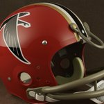
The 1966 Atlanta Falcons logo was designed Wayland Moore, featuring a minimalist, geometric black falcon that creates the visual silhouette of a capital letter "F".
Created for the team's inaugural NFL season, logo has remained franchise’s visual identity for four decades.


Sports Design Agency retweeted
1966 Atlanta Falcons logo was designed by accomplished sports artist and illustrator Wayland Moore, featuring a minimalist, geometric black falcon that cleverly creates the visual silhouette of a capital letter "F". 60 YEARS ASSHOLES.


Sports Design Agency retweeted
So no pro sports teams can feature red/black and a touch of gold?
Did you know big bird was part of the Stalin Gulag... yes... he loved large yellow bird mascots.


Masterclass in finding a number font from an existing type font to match a custom lettered team wordmark. FRIZ QUADRATA was the ideal match for the sharp serif WARRIORS lettering. @NBA @The_Clios @warriors @GameplanChicago @Fanatics


Sports Design Agency retweeted
Thursday. Sports Branding Substack explores the possibility the @WashWizards will be going "Back to the Future" changing their team branding back to the 1997-98 identity.
It's an interesting story. Check it out.
@SportsDesignUSA @washingtonpost @WashWizards


I'm soooooo fucking back! Nobody Beats the Wiz.
nytimes.com/athletic/7677666…


