

🏒🇨🇦 he/him
Joined January 2012
- Tweets234
- Following218
- Followers265
- Likes282




In honour of the Islanders jersey design contest that just wrapped up, here are eight Islanders concepts I've created over the years...


1
8
470
More details on my latest blog post, plus I've ranked the eight finalists from the fan vote! Link below...
stevengrantdesign.blogspot.c…


1
2
78
I had two goals for this Utah Mammoth concept, firstly I wanted to try their U/tusk logo as a front crest, and secondly I wanted to use mountain stripes without looking too much like the Avalanche.

4
299
I went with a NASA concept to honour the successful Artemis II mission! The design is partially inspired by NASA's blue flight suits and white spacesuits. Vote Below!
(moon photo is Apollo 14 astronaut Alan Shepard)


Which artist qualifies for the head-to-head 2026 JN Open Final?
🧵 6/6


71%Jets - Carter Richard
7%Torrent - Burkus Circus
21%NASA - Steven Grant
14 votes • Final results 3
323
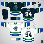
The Canucks are the best team to make concepts for because they have so many different eras to be inspired by. This concept combines elements from their original stick-in-rink and orca jerseys. It also uses the Reverse Retro Johnny Canuck logo, and a new shade of green.

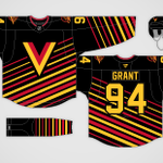
Happy New Year!!! For this concept I used the angled stripes from the Canucks' Skate logo, while using the V from their Flying-V jersey as the main crest.

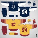
I'm starting to think the NHL should go with colour vs colour for their next league wide jersey program, so I gathered some of my old concepts to see how that could look.
Here's the Pacific Division...
(🧵1/4)


1
2
239


Here's a closer look at my Team Italy concept! I went with a vertical stripe, since Italy's flag is a vertical tricolour.
Vote below!

187
The Blackhawks current road jersey doesn't use enough red, so I designed a new version. I also threw in some vintage touches, since they are 100 years old now.

4
251
I predict in a few years the Capitals will promote their new third jersey and make a matching road version, however I think/hope they'll swap out the "Screagle" for their far superior "Weagle" logo.

1
7
229
The Jets have had the same primary jerseys for fifteen years now, maybe it's time for something new. If so, I think they should use their Aviator Blue as the main colour.

2
237
I thought the Reverse Retro version of Johnny Canuck might work well in the original orca colour scheme, so I made this concept to test it out.

The best part of the Kings' recent rebrand is their updated crown logo, it needs to go on the front of a jersey sooner than later.

2
6
507
This concept is a tweak of the Ducks current set, with the most noticeable change being the swapping of white and black on the home jersey's stripes.

1
135
The Bruins should add a yellow third jersey to their rotation, and I also think they should wear these yellow socks with their new home jersey.

2
141
I really like the Rangers new centennial jersey, so I decided to create a road version to complete the set. I chose a faux-leather look for the pants and gloves.

4
365
