

Brand Identity&Sound&Motion Designer&Art Explore Cognitive science&Linguistics&Blockchain Featured on @contra 📩DM is open. Be curious about the world.🌟
Joined July 2026
- Tweets696
- Following98
- Followers252
- Likes1.6K


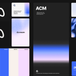


Check more details here: acreamstudio.com
My design thoughts:
The main title logo uses a shadow treatment to create a glossy finish. Hovering over the title reveals a soft brand-color gradient. The gradient is applied only to the top and bottom edges of the letters, leaving the text color untouched for a restrained, elegant look. The
"About" section keeps a minimal design, and sweeping the cursor across "Think like Acream" triggers a smooth little a smooth little easter egg animation. Hovering over the email address brings up a vibrant animated stripes effect.
The main title logo uses a shadow treatment to create a glossy finish. Hovering over the title reveals a soft brand-color gradient. The gradient is applied only to the top and bottom edges of the letters, leaving the text color untouched for a restrained, elegant look. The "About" section keeps a minimal design, and sweeping the cursor across "Think like Acream" triggers a smooth little a smooth little easter egg animation. Hovering over the email address brings up a vibrant animated stripes effect. Check more details here: acreamstudio.com
I was doing some design work and suddenly realized something: excelling in any creative field shares a common thread. I need to build a solid foundation before I try to innovate.
For example, visual design relies on math and spatial concepts as a baseline for creative expression, while sound design requires a deep understanding of low, mid, and high frequencies before I can experiment.
Foundation first, followed by random inspiration and acute sensitivity.
Created these floating color ribbons using polar coordinates. Simulating 3D depth purely through dynamic gradient shifts, all while keeping that soft feel.


The motion design version is done! Check it out here. teapawt.net/acream_1/status/211323…