

Product Design Partner → https://teapawt.net/t.co/bRnaTlsz9h Design that moves revenue for startups | 10+ years | 50M+ users | $13M+ impact Ex Citi, Mercedes, Sky, NatWest
Book a call →
Joined April 2023
- Tweets2.8K
- Following348
- Followers674
- Likes3.5K




Pinned Tweet
Seeing a few new faces here, so thought I'd reintroduce myself...
Hey, I'm Ali.
I run a product design studio helping founders and product teams build better software.
I've spent over 10 years designing products used by more than 50 million people, contributing to over $13 million in business impact along the way.
I've worked on products for the likes of Mercedes-Benz, Citi, Virgin, Sky, NatWest, BCG and many more.
And here's something I've noticed over the years:
As software products grow, the experience doesn't always keep up.
→ New features get added
→ User journeys become more complicated
→ Design inconsistencies start creeping in
→ Teams get so focused on shipping that UX takes a back seat
Eventually you've built a powerful product that's harder to use than it should be.
And that starts affecting more than just design.
Users struggle to see the value, onboarding becomes a bottleneck and adoption & conversion suffer.
That's where I come in.
I work with founders and product teams to improve the experience, remove friction and turn complex software into products that perform better.
It's also what I share here:
Product design, UX, lessons from real projects and the thinking behind better software.
If you're building a software product and the experience isn't keeping up with the business, DM me. Let's chat!
- Ali

I think AI is making it dangerously easy to confuse progress with productivity.
You can spend an afternoon generating interfaces, building prototypes and exploring completely different directions.
And feel like you've achieved an incredible amount. But how much of it actually moved the product forward?
That's the question I'm trying to keep asking myself.
I'm enjoying how much more I can experiment with tools like Claude Code.
But I don't want the ability to make things quickly to become a reason to make things unnecessarily.
Being busy building things and making meaningful progress aren't the same.
2
39
I worked on a referral experience for a UK digital bank that now serves over 2 million customers.
One of the most interesting things we discovered was that customers understood how to earn their referral reward, but couldn't work out when they'd actually receive it.
That's a bigger problem than it sounds.
Referrals were an important acquisition channel, yet uncertainty after signing up was creating unnecessary support demand.
The experience needed to answer three simple questions:
→ Am I eligible for the reward?
→ Have I completed everything required?
→ When will I actually get paid?
We worked on the referral landing page, an in-app progress widget and a dashboard to make the process clearer.
What I find interesting about projects like this is how easily a support problem can actually be a product problem.
Customers shouldn't need to contact someone to understand what happens next.
1
3
174
Most apps drop you on a dashboard after you sign in, so the first thing you do is go looking for what you were doing.
Explored signing in straight back into the sentence you left on your phone.
2
4
165
After 10+ years working in product design, one of the things I've learnt is how much the smaller decisions affect the overall experience.
Especially when you're designing complex software with a lot of different users, workflows and requirements.
Take default settings.
It's easy to focus on giving people as much flexibility as possible, but there's a lot of value in deciding what should happen before someone changes anything.
A few things worth thinking about:
→ what information should be visible immediately
→ which options most people actually need
→ what decisions can safely be made for them
→ what happens when someone needs something different
→ how easy it is to change things later
Every additional setting is another decision someone has to make.
And when someone is trying to get their work done, they probably don't want to spend half an hour configuring the product first.
That's why I'd put just as much thought into the defaults as the customisation options.
1
5
290
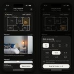
Photos sell a flat, but the floor plan is what tells you if it works. Explored joining the two, so every photo shows which room it is and where it was taken from.

2
9
301
If you’re a Series A SaaS founder shipping a feature a month while activation stays flat, the next feature probably isn’t the fix.
At a major UK telecoms company with over 5 million customers, mobile checkout was converting at 8%.
We didn’t start with new features or a visual redesign.
We started by mapping the journey customers were already getting stuck in.
Six weeks later, checkout was converting at 24%.
A confusing product rarely looks like a design problem on a spreadsheet.
It shows up as:
→ Trial users who sign up and never reach the part worth paying for
→ Sales demos doing the job onboarding should be doing
→ Support answering the same “where do I find…” questions every week
→ Engineers reworking features after launch because people couldn’t use them
In my experience it starts in one of three places: a flow with too many steps, navigation that grew one feature at a time, or a product built in pieces nobody fitted together.
Fixing what’s already there is usually worth more than the next feature.
Photos sell a flat, but the floor plan is what tells you if it works.
Explored joining the two, so every photo shows which room it is and where it was taken from.

6
214
If you're a founder who can get a polished screen out of AI in an afternoon, the screens were never the expensive part.
I've spent 10+ years designing products used by 50M+ people, and every new tool, from Photoshop to no-code to AI, has replaced only the delivery part of design.
We redesigned a customer journey by looking at where people got stuck, what information was missing and which parts created avoidable demand, and it delivered £11M in NPV over three years and cut calls by around £5M a year.
The goal was to stop customers needing to contact the business at all, and 86% of them preferred the new experience.
Use AI for the screens, but spend your own time on what to build, why it matters and when something is wrong.
2
7
329
Plenty of my product work this year has been improving journeys that already exist, rather than designing from scratch.
That work needs a different approach to a blank page:
Not just a better version of every screen.
A product with users already has habits built around it, and changing everything at once throws those away along with the problems.
That might mean:
→ finding out which parts people already rely on before touching anything
→ fixing the step support keeps having to explain
→ keeping the words customers have already learnt
→ changing one thing at a time so you can see what moved
→ leaving the parts that work exactly as they are
The referral project I worked on this year was like that: the flow was getting people through, but more than 90% of the support calls came after they'd signed up.
That's what improving an existing product comes down to.
Not starting again. Finding the few places it's letting people down and leaving the rest alone.
5
130
I worked on a resourcing platform for a global consulting firm that reported over $14 billion in annual revenue.
Being available didn't mean someone was right for the work, or that the budget fit.
The interesting design problem was showing those trade-offs in one place.

1
3
77
Most photo apps make you edit one picture at a time, but people judge a trip by how the whole set looks 📸
Explored treating the album as the thing you edit, not the photo.

2
5
219
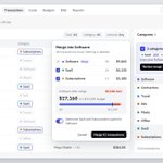
Most expense tools let anyone add a category, so software ends up split across three of them and the budget only watches one.
Exploring spotting the duplicates and merging them in one step.

8
334
I worked on a mobile checkout project in the telecoms industry where conversion increased from 8% to 24% in just six weeks.
We reduced the journey from 12 steps to 7.
It's a good example of why I think improving an existing product can be more valuable than constantly adding new features.
Sometimes there's a lot of value sitting inside the experience you've already built.
2
181
The moment after you tap a button is usually dead space in an interface.
Explored letting that button become the thing you're waiting on, then turn back into the next step.

5
14
350
Designing everything around a design system from day one can actually hold back creativity.
Especially now with tools like Claude Code.
Sometimes I just want to open Figma, explore ideas, try things out and focus on making something really good.
Without worrying whether every decision fits an existing component or design token.
Once I'm happy with the design I can use Claude Code to turn those decisions into a proper system, following the structure I've already defined.
What used to involve a lot of manual cleanup and back and forth is now much easier.
I can focus on the craft first and let AI help with the structure afterwards.
Let the design inform the system, rather than the system dictating the design.
Photos sell a flat, but the floor plan is what tells you if it works.
Explored joining the two, so every photo shows which room it is and where it was taken from.

4
142
I'm enjoying being able to design without worrying about fitting everything into a design system from day one.
Right now I'm designing in Figma with raw values, focusing on the craft and exploring ideas without too many restrictions.
Once I'm happy with the direction, I build a skill that lets Claude Code turn those decisions into a proper system, using the structure I've already defined.
It used to involve a lot more manual cleanup and back-and-forth.
Now I can spend more time designing how things should look and work.