

App Designer 🚀 | Coffee addicted ☕ | Helping founders improve their onboarding and paywall to make more money🫰🏼
Remote, living in Bali 🇮🇩
Joined December 2024
- Tweets677
- Following947
- Followers545
- Likes973






Pinned Tweet
Giving away a free app audit every day!
I’m new here, so this is my way of getting to know you and giving something back.
Every day I’ll roast an app: onboarding + paywall, where the magic (money) happens. 💸
Drop your App Store link below and I’ll tell you what I’d fix first.

You can't explain an aha moment. People have to feel it 🙌🏼
In a language app, it can be the first sentence you understand without looking anything up.
what's your app Aha moment?
If your onboarding asks me what I want, show me you listened 👀 Otherwise the questions are just extra steps.
Half my roasts end with the same advice: delete what the AI added 😅
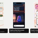
Extra text, a mascot on the first screen, a pet in every screenshot.
What's the last thing you removed from your app? 👀

Most founders treat the paywall as the finish line 🏁
But the first sessions after someone pays are where you keep them, or lose them.
Are you paying enough attention?
Medewi 🌊 is one of my favourite places on this island. There is absolutely nothing. Every time I go there I recharge. Just surfing, reading, friends or time for myself. I feel so much gratitude in this place. Bali is not only Canggu and Ubud.

Let the hunger games begin.
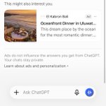
This is the first time I see non-related ads in ChatGPT.
Have you seen ads already?

Your user's patience is a battery 🔋
They download your app fully charged, and every screen you ask them to go through drains it.
Ask only for what you need right now.
I wrote more about where to put sign-up (and what it costs you) here 👇
brewedinpixels.com/indie-cre…


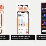
6 of my last 13 roasts had the same problem: the AI added stuff nobody needed 🙈
3 fonts, tiny text no one can read, pretty images that say nothing.
For the AI, adding is easy. Your job is to remove. And if you need a hand with yours, just let me know 🙌🏼

Every morning a frog comes to my place, naps in the shade and leaves in the afternoon 🐸
I tell her every day that I hope she feels at home.
Might sound silly, but seeing her makes my day every time 🥹

Earlier today: Loggd's App Store page. Now I'm going inside the app 📲 @BalanEusebiu.
1. The welcome screens.
What does "Level Up Your Life" mean? Lead with the main focus: building habits that change your life 🌱
3 screens with a mix of everything is too much noise.
Thread 👇

Part 3/3 🎥 On the paywall I still don't know what tags are. Then on Tasks I got stuck: the bottom menu only showed when I scrolled. Make it sticky.
Tell me clearly what you offer that other trackers don't 💚
Thanks for sharing it @BalanEusebiu!! Who's next? Drop your app 👇
Part 2/3 🎥 Choosing a character is a super cute way to gamify 😍
But "Continue as guest" sits top right, where the Skip was. People expect it at the end of the screen, so put it under "Use email".
And the "Not from zero" text is super small, hard to read
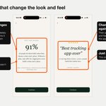
3. Screens that change the look and feel.
Suddenly a light screen with different fonts (the 91% stat, then a review). It seems it popped up from somewhere else, and it takes me out of the app.
And just one review feels kind of weird 🤔

Part 1/3 🎥 with subtitles, because I know you're not turning the sound on 😅
"Hi, I'm glad you are here" with the pet moving is nice, but it's not telling me anything. Show me what could create an impact, or it's just one more friction screen
2. Let's talk.
Showing me how it works before asking me is interesting 👌 And the option to write is good, sometimes I don't want to speak.
But there's a lot of text to remember before I tap the mic. Make it step by step and keep the chat style of the screen before

Another roast 🔥 Loggd by @BalanEusebiu. App Store page only.
1. Icon, title & subtitle.
The icon reads as a check, but might not stop the scroll.
"Habit Tracker & Planner" is a very used keyword, and "Streaks & Reminders" isn't using all the keywords available 🙈
Thread 👇

Part 2/2 🎥 My main tip: double check the main benefits people get from the app. Then keep only two lines of text, big enough, with words that help your keyword positioning 🔑
Thanks for sharing it @BalanEusebiu!! Tonight: the onboarding 👀
Who's next? Drop your app 👇
