

Not an expert. Probably eating steak and overthinking
Canada
Joined July 2011
- Tweets2.9K
- Following249
- Followers296
- Likes2.5K




Day 17 of handwriting old sales letters to become a better copywriter.
And today will be my last sales letter breakdown.
While I do think that copying these sales letters has definitely helped me, this isn’t the best use of my time.
For me the breakdowns were a way to start posting consistently on X, but also a way to get better at writing copy.
I do think they have helped me become better at writing copy, and I might continue to use copying these letters as a way to get pen to paper and get into a flow when I get stuck.
We’ll see.
But, if I’m being honest for the 1-2 hours these breakdowns take, my time is better spent doing something with higher leverage.
Which is writing my own copy.
I’d rather spend that extra hour in the day to draft another piece of copy or edit or revise a piece I’ve already done.
It’s tough to give up this format since it helped me gain consistency with posting on X everyday.
But, it needs to end.
I’ll continue to post, it just won’t be in this format of breaking down sales letters.
Now, for today’s final breakdown.
I thought it would be best to end it with another VW ad.
And it’s the ad that closed the book on the Beetle campaign.
This final breakdown will be short.
I couldn’t end this series without doing at least one more. This ad suits it perfectly.
Ad: Lime
Written by: DDB
Product: Volkswagen Beetle
Takeaways
1) Flashback
This ad was released in 2019.
And honestly, it’s such a great tribute to the VW line.
It’s basically a modern call back to the famous Lemon ad in 1960 that I’ve broken down already.
But, rather than rejecting and pulling cars off the line for a small blemish.
They're pulling one off the line for it being PERFECT.
And for it to go sit in a museum. It was VW’s way of letting everyone know they’re discontinuing the Beetle.
The lemon had the flaw, but this final VW is a lime. Flawless.
2) Why it works & a great goodbye
It’s crazy to think that an ad could be so iconic that they could reference it decades later and people would still understand.
Think of the impact that ad must have had.
I also think it's impressive how they turned this bad news into a celebration.
Typically when a car gets discontinued it's probably not for good reasons.
Sales were probably down.
They owned the negative and flipped it into a positive.
Basically, the whole objective of the original Beetle campaign.
Turn negative features about the car into positives.
END OF BREAKDOWN
This ad was a perfect way to end these daily letters.
I love that VW campaign.
I’ll see you tomorrow.
Just not with another breakdown.


1
5
110
Day 16 of handwriting old sales letters to become a better copywriter.
Today’s ad is another classic about teeth.
And it uses a similar structure that the Pepsodent ads also used.
But rather than focusing on film on your teeth, this ad focuses on keeping your gums healthy.
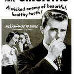
Ad: Do your gums bleed?
Written by: Unknown
Product: Forhan’s toothpaste
Takeaways
1) The image shames
The image does a great job at capturing the attention and producing the feeling of embarrassment.
It’s two women whispering, with a man covering his mouth. He’s ashamed to smile because of his gingivitis.
You can feel and tell it’s about being embarrassed right away before you even read a single word of copy.
2) Most likely a victim
The subheadline reads “4 out of 5 can be victims and not even suspect it”.
Right after reading that you understand that you actually have a better chance of having it than of not having it.
But this next part is where it leads you down the slippery slope and you keep reading.
“Not even suspect it”.
The ad introduces fear in a great way here. First, you most likely have it by the statistics and you probably don’t even know it.
It catches your attention and you want to know how you can prevent it or know if you have it.
So you keep reading.
3) Your current toothpaste is the problem
“Don’t use a product to merely clean your teeth”.
Right then it’s telling you your regular toothpaste isn’t enough. All it does is clean your teeth.
It’s not massaging your gums and preventing gingivitis.
It then presents Forhan’s as the obvious solution. Its “double-purpose” is to clean your teeth and massage your gums.
One tube, with two jobs. And it’s the only one that does both.
“No other paste, powder, or liquid contains this Forhan formula”.
4) Urgency
There are multiple times where the ad introduces urgency and highlights the words “Start at once” in italics.
It also ties it back to the headline nicely because a lot of times you don’t see symptoms. One of the symptoms is your gums bleeding so this line below ties it in well.
“Don’t wait for bleeding gums to warn you”.
It’s telling you to act now. Don’t wait until it’s too late.
This ad was interesting. Especially after comparing it to the Pepsodent ads.
Rather than focusing on whiter teeth, a problem you can typically see. It focused on gum health, an issue you sometimes can’t see until symptoms arrive.
Also interesting how they both used future pacing.
“Notice the difference in the way your gums soon feel and look”.
Both are very confident in their product.
END OF BREAKDOWN
This is just my take and what I SEE from reading these letters. I may not always be right, and probably will be wrong a fair bit.
If you find something I’m doing wrong or have something to add, please tell me below.
Anyways, thanks for reading if you made it this far.
I’ll see you tomorrow.


Day 15 of handwriting old sales letters to become a better copywriter.
The ads in today’s breakdown started to run around 1962.
And according to swiped, they increased their market share from 11% to 34% in a span of 4 years.
That’s pretty impressive in that time span.
There is one main ad I copied and then 4 or 5 smaller ads taking from the main one.
So, I’ve only copied the main and a smaller one as they follow similar formats.
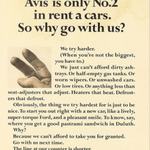
Ads: We Try Harder
Written by: DDB (agency)
Product: Avis rental cars
Takeaways
1) Headline admits a weakness
“Avis is only No.2 in rent a cars. So why go with us?”
This headline instantly grabs your attention, and interest.
Why would you go with the no.2 guy? It’s such an interesting take to admit being No.2.
Rather than hide it, they owned it and spun it into a positive.
2) Turning the weakness into a positive
“We try harder. (When you’re not the biggest, you have to.)”
After owning number 2, they turn all the positives being number 2 provides to the customers.
Which provides great benefits.
But they do it in such a great way. They list off all the annoying things that can happen when you rent a car and turn it into things they CAN’T do.
They can’t afford to look past these things because they are only number 2.
They have to provide the best service they can because they don’t have the luxury to let these things go like number 1 potentially can.
There is some alluding to the fact that number one does let these annoying things happen because they can.
3) One ad to many
I love how from the main ad I wrote down it was spun into 4 or 5 different smaller ads all following a similar format.
All around the same premise.
They can’t afford to do things you hate to find when you rent a car.
Bad wipers, no gas, dirty ash tray, etc.
They own the fact that being number 2 makes them provide better service. They can’t slack like the main guy can.
Overall, I think it's a great campaign. With the main takeaway being them owning where they stand.
They don’t try to fabricate or lie about being the biggest or best. They accept being number 2 and turn it into something that is actually a positive.
And something that makes you perceive them as better than the number 1.
I’d be curious to know if someone else has ever used this in a different industry.
I would argue it's somewhat similar to what VW did with their beetle ads.
Not necessarily saying they were the Number 2, but accepting the car for what it was and owning that.
It was also the same agency for both campaigns. DDB.
END OF BREAKDOWN
This is just my take and what I SEE from reading these letters. I may not always be right, and probably will be wrong a fair bit.
If you find something I’m doing wrong or have something to add, please tell me below.
Anyways, thanks for reading if you made it this far.
I’ll see you tomorrow.


Does copywork actually help?
I’ve seen this question floating around a lot lately on X, so I thought I‘d take the time to give my opinion on this.
I’m not a great copywriter by any means. These are just my thoughts on whether or not it helps and what I’ve learned in only 14 days.
And my honest answer?
It depends.
While I do think it CAN help in some ways, copywork by itself will not make you a better copywriter if it’s the only thing you do.
How do you get better at copywriting?
Actually writing copy…and it’s the same process for anything you want to learn.
You learn by doing it.
You want to get better at a sport? You PLAY the sport more.
I’m well aware of this, so why do I continue to do copywork?
First, I like the consistency it provides me to get pen to paper every day no matter what.
But also, before I started writing them into X posts, I would usually do some copywork before I started writing copy.
I found this helped get me in a good flow. Even if it was only 5 minutes of copying an old letter.
Then I would begin writing.
I also found I would only catch things in the ad once I actually wrote it down. If I just read it, I would miss things sometimes.
But, I’ve also seen people say if you’re going to do copywork do it with copy that’s from this era, etc.
This is where I would push back a bit. I think that does make sense, but at the same time the argument usually contradicts itself.
If writing old sales letters from some of the greats (Halbert, Hopkins, Ogilvy) isn’t relevant anymore because the times have changed…
Would reading all these classic copywriting books written by these guys also be irrelevant?
Think about it, all the letters you copy would have used the SAME principles in the books everyone swears by and recommends to read.
All these letters you’re reading would have used the EXACT principles you’re reading about, because the guys who wrote the books are the guys who wrote many of these classic sales letters.
The Boron Letters, Ogilvy on Advertising, Breakthrough Advertising, etc.
Everyone recommends these books.
To my point, I think copywork can help.
But, I’d treat it more like reading a book.
It’s consumption. It’s not practice. It’s not actually DOING the thing.
It can’t be the only thing you’re doing to be getting better at copy. You need to be WRITING copy and hopefully getting feedback on it in some way.
If you do decide to do copywork, I personally like to break them down. Just copying it mindlessly definitely won’t do much of anything.
Unless it’s just to get pen to paper and get in a rhythm.
But what works for you might not work for someone else.
The best way to find out is to try it for yourself.
And will I do copywork daily forever? Probably not.
I only plan to post about it for another 1-2 weeks.
The actual work always takes priority. Once it starts to interfere too much it will have to take a back seat.
Day 14 of handwriting old sales letters to become a better copywriter.
Today’s ads are from the most famous luxury watch in the world.
What comes to mind?
Rolex.
It’s been around since 1905 and has been known for being luxury.
There will be 2 ads in today's breakdown.
Ads: Oyster Case & James Bond
Written by: Unknown
Product: Rolex Submariner
Takeaways
Ad 1- Oyster case
1) The rhythm
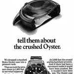
The first ad ran in the Skin Diver magazine in 1972 (you can see it at the bottom of the ad).
It may have run other places but I'm not 100% sure.
The first thing I see from this ad is the rhythm and suspense it builds.
All the lines are short and the numbers keep climbing.
“Nothing happened”.
And then “Then we went down to 1500 feet. Nothing happened”.
You keep reading because you want to find out when something DOES happen.
2) Great line about quality
There was a great line in the ad before it got into the “nothing happened” section.
The line is: “We dropped a standard Rolex oyster case into a pressure tank”.
This line doesn’t seem like much, but I think it’s brilliant because of one word.
Standard.
There was nothing special about this specific watch. It’s STANDARD.
So everything you read about the build quality and testing is just from a standard Rolex oyster case.
It’s nothing special, and it’s still built with extreme durability and quality.
3) Honesty
This isn’t much but they do admit that the inside movement would have been crushed.
Not wet. But crushed.
I think the important thing here is the furthest anyone has dived was just over 1000 feet.
That’s far deeper than any diver would ever take it.
Again, just speaks to the quality and reassures divers it’s built for this.
Ad 2- James Bond
1) Any level
The “any level” part in the beginning of the ad has a double meaning.
And most of the ad hangs on that line.
The double meaning: depth under the sea and the social level.
I think this gets intriguing because the image itself has no ocean in the picture.
Just a hand of a woman touching the watch on the man's wrist.
So when you read the beginning about it working perfectly at 660 feet under the sea and then any level you start to wonder what it could mean.
What other levels could there be?
2) Borrowed credibility
“Official watch for divers of the Royal Navy”.
I’ve seen this borrowed credibility in previous ads. It was in the Honda one yesterday.
It’s a subtle flex.
The transition from here is great too. It goes from credibility from the sea to the bar instantly.
“How come it’s seen so much where the wettest thing around is a dry martini?”.
3) Favourite line
This is my favourite line and it’s the ending.
“Ask her. Maybe she knows”.
It ties everything back about the watch working at any level.
But what it really does is it points everything back to the image. It ties the copy and image together.
It suggests status, and that women notice it. But, the final line drives home the point.
“When a man has a world in his hands, you expect to find a Rolex on his wrist”.
It’s no longer about diving, but what type of man you are. A successful man.
Both of these ads were great. One product, but two different ICP’s.
Divers get proof it works, and businessmen get status built on that proof.
END OF BREAKDOWN
This is just my take and what I SEE from reading these letters. I may not always be right, and probably will be wrong a fair bit.
If you find something I’m doing wrong or have something to add, please tell me below.
Anyways, thanks for reading if you made it this far.
I’ll see you tomorrow.


Day 13 of handwriting old sales letters to become a better copywriter.
Today’s ad is a smaller one.
And I’ll be honest…
It almost feels like cheating to me when I do a shorter ad or don’t write down at least 3 pages of notes in my Google doc.
It’s very easy to get caught up trying to one up your previous post or break down.
Taking at least 1 or 2 things from an ad is a win.
Like I said when I started, the importance to me is the daily habit and learning something from the ad.
Even if it’s one thing.
I still do like to break the ads down in as much detail as I can, but there will be days when it will be shorter than normal.
Now, into today’s ad.
Ad: Most Engineers Are Given A Budget (1987)
Written by: Unknown
Product: Honda Riding Lawnmower
Takeaways
1) The headline
The headline instantly captures your interest.
“Most engineers are given a budget. Honda’s are given a goal”.
I love it. It’s confident.
It calls out every other mower brand cheap without actually naming anyone.
Honda’s saying we're building the best thing we can.
While they’re not saying their competitors aren’t. They’re just saying we didn’t cheap out.
2) The backhanded compliment
They instantly double down on the headline in the first paragraph.
“Which is not to take anything away from our competitors..”
“After all, giving the budget top priority, putting cost before quality, is a fairly well accepted way of doing business”.
I think these lines do such a great job to prove the point.
They’re saying listen there’s no hard feelings if you want a cheap mower. But it’s just not what you’re going to get from Honda.
3) Philosophy and credibility
They then state their philosophy which is to exceed expectations of even their most demanding customers.
The purpose of this ad to me was for a way for Honda to separate itself from the competition and from other brands competing on price.
If you want quality, get a Honda, if you want cheap, go somewhere else.
They’re positioning themselves as the premium lawnmower.
They then pull some credibility.
“The same advanced engineering expertise to our Riding Mower that we do to our automobiles”.
Honda’s have always been known around the world for being reliable.
4) Closing line and CTA
This is my favourite line in the ad. It comes after they list the benefits.
“Ours are built to satisfy engineering goals. Not accountants”.
It just ties everything back to why Honda is the premium choice.
To me it’s basically saying that we at Honda care more about providing an exceptional product to YOU our customers than putting money in our pocket.
As for the CTA it was just for you to stop into a local dealership.
But, overall a great brand awareness ad with Honda positioning themselves as the PREMIUM choice. Not the cheap choice.
END OF BREAKDOWN
This is just my take and what I SEE from reading these letters. I may not always be right, and probably will be wrong a fair bit.
If you find something I’m doing wrong or have something to add, please tell me below.
Anyways, thanks for reading if you made it this far.
I’ll see you tomorrow.


Day 12 of handwriting old sales letters to become a better copywriter.
Today’s ad is a great one by Claude Hopkins.
The ad had 3 different variations.
It’s the same product, same offer, and the same “5 mistakes”.
For the most part, only the hook changed.
Some of the details were presented in a different order. But, they all have relatively similar bones.
That’s what creative testing looked like 100 years ago.
I recommend reading them all and comparing them.
Today I’m breaking down the “Learn why” version.
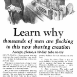
Ad: Learn why thousands of men are flocking to this new shaving creation
Written by: Claude Hopkins (and agency)
Product: Palmolive shaving cream
Takeaways
1) Headline
This ad has a very similar structure to the Pepsodent ads from a few days ago (both ads were written by Claude Hopkins).
As for the headline here it grabs your attention, calls out the ICP, and has social proof.
Attention - “learn why” and “flocking to this NEW creation”
ICP & social proof - “thousands of men”
Interesting from the Pepsodent ad, this mentions the 10-day tube right away in the subheadline.
The Pepsodent ad mentioned the 10-day test, but never said it was free in the headline or subheadline.
2) Humble opening
Unlike the Pepsodent ad, this one isn’t overly confident.
I wonder if Hopkins did this due to the fact this wasn’t this brand's main category like Pepsodent’s was toothpaste?
They plant more curiosity rather than confidence.
“Your present shaving soap may be exactly fitted to your needs, or it may be failing in one of five important ways”.
It never says ours is for you. It plants the curiosity.
It leads you down the slippery slope. You want to know what the five ways are. What if yours is failing you?
3) Mistakes turned to benefits
Before I get into this part I do like this line.
“80% of the users of Palmolive Shaving Cream once were wedded to rival preparations. We won them by sending a 10-day tube for trial”.
It just sets the next section up perfectly. Just showing a bit of confidence.
Saying hey, most of our current users switched from another brand after trying the free tube.
I think it’s great, and subtle.
Now, rather than listing their benefits they list the mistakes other shaving creams make and how they’ve corrected these.
Turning your pain into benefits.
4) The offer
Before it gets into the offer, they borrow some credibility from their soap.
“We’re masters of soap making” and “One of our soaps - Palmolive - leads among toilet soaps of the world”.
(toilet soaps meant bath and hand soap back then).
They didn’t have as much credibility in shaving cream as they did in soap, so they found ways to borrow trust from their other products and inject it into this one.
If you trust their soap, why not trust them to make a good shaving cream?
The offer is then very similar to the Pepsodent offer. A 10-day free trial.
But like I said earlier there was no future pacing or assured confidence.
“Do us the kindness to mail this coupon, for your sake and for ours”.
They’re asking permission, and asking you to trust them. It’s a different approach than the Pepsodent ad.
Also important to note they’re also giving you a free sample of after shave.
It wasn’t once mentioned in the ad, but on the coupon and the text under the brand name in the bottom left corner.
I assume this was not to take away from the main product and keep it focused just on the cream.
Palmolive to this day still does sell shaving cream.
I had no idea.
I believe it's a lot more popular in Europe than it is in North America.
I’ve personally never seen it in the store before, but it is available on amazon.
It’s interesting how this ad is very similar to the Pepsodent ad. It ran about 4 years after in 1925.
I’d assume Hopkins had great success with the Pepsodent toothpaste 10-day free trial, he figured the same playbook would work just as well with shaving cream.
But like I said earlier the part that intrigues me the most is why he wasn’t assuring as much confidence as he was with Pepsodent?
I think a lot of it was probably due to the fact that if people knew them as a soap company, why would they trust them for a shaving cream?
So rather than telling you to try it, he asked for a chance instead.
Would love to hear some other peoples thoughts on this.
END OF BREAKDOWN
This is just my take and what I SEE from reading these letters. I may not always be right, and probably will be wrong a fair bit.
If you find something I’m doing wrong or have something to add, please tell me below.
Anyways, thanks for reading if you made it this far.
I’ll see you tomorrow.


Day 11 of handwriting old sales letters to become a better copywriter.
I just keep finding more and more of these VW ads.
Just when I think I’ve seen them all, another one pops up.
Today’s ad is definitely a polarizing one.
It was a bold humour play by VW and I don’t think there’s any chance a brand would do this in 2026.
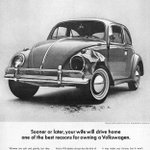
Ad: Best reasons for owning a Volkswagen
Written by: DDB (agency)
Product: Volkswagen Beetle
Takeaways
1) Image & headline
This ad headline and image definitely made a few people chuckle when they read it.
The smashed up car instantly grabs your attention.
First, it is kind of odd for a company to put an image of their product damaged.
But it plays into their ad so well and the whole VW campaign over the decade since it launched.
Now the headline.
There’s an old stereotype that women are bad drivers, and you probably still hear it today.
The headline reads “Sooner or later, your wife will drive home one of the best reasons for owning a Volkswagen”.
Basically the headline is assuming the damage in the image is from your wife. Or what it will eventually come home like when she drives it.
It’s funny. It catches your attention and it has controversy.
I can imagine when they released this ad people were talking about it non stop.
I’m sure most men found it funny, can’t say the same for women.
2) The ad is speaking to men only
After the first line the ad says “If your wife” implying that this ad was for men and the ideal ICP is men.
It was typical for the man to be purchasing the cars in the 1960’s and rarely women.
Women often couldn’t get credit in their own name until the Equal Credit Opportunity Act in 1974.
So even though she’s the one driving it, the ad was aimed at targeting the men. Since they were the buyers.
3) Fender benders are no big deal
Once the headline and the first few lines make you laugh and grab your attention the ad follows the same similar VW ad benefit.
The car is small, but a little bit of fender damage won’t break the bank. It’s also cheap to replace and almost every VW has the same one.
So it’s almost always in stock.
It’s also EASY. Just 10 bolts.
Another little subtle flex.
But it doesn’t stop there. The ad continues to poke fun at women being bad drivers.
It doesn't matter what part of the vehicle gets damaged.
Hood, door, or bumper. The repairs won’t make you poor.
I love this line.
After they list out all the items that would be cheap to fix if your wife was to damage them the ad says
“It may make you furious, but it won’t make you poor”.
Tying everything back to the purpose of the ad. A VW is cheap to own and maintain.
4) The final lines
The play on words here is brilliant and it’s probably my favourite part.
It sets it up with “So when your wife goes window-shopping in a Volkswagen..” She's not just shopping.
She’s driving through the window.
“You can conveniently replace anything she uses to stop the car. Even the brakes”.
Even the part of the car you’re supposed to use to stop it is replaceable.
It’s hilarious and the whole ad is comedy.
The purpose of these brand ads was to draw attention. VW does a great job with this in all their ads.
They take some sort of bold take or opinion and spin it into something memorable and fun.
Most of the beetle campaign was very loose and fun. They weren’t afraid to joke around and be playful.
I think a lot of ads have lost that. But, I also think it’s a different time.
If a car company tried to run something like this in today’s time it would most likely receive major backlash.
It’s crazy to see how the times have changed when it comes to these things.
END OF BREAKDOWN
This is just my take and what I SEE from reading these letters. I may not always be right, and probably will be wrong a fair bit.
If you find something I’m doing wrong or have something to add, please tell me below.
Anyways, thanks for reading if you made it this far.
I’ll see you tomorrow.


Day 10 of handwriting old sales letters to become a better copywriter.
I believe today’s ad is the first one with the offer being high ticket.
All the break downs I’ve done so far have either been brand marketing or for a product with a smaller price tag.
But the objective of this letter is slightly different.
Its objective is to get you to book an appointment to look at an apartment.
Ad: 5 Years ago, You could have bought this apartment
Written by: Unknown (for Parc Vendome)
Product: Parc Vendome apartment
Takeaways
1) The big bold headline + hook
This headline does a lot of the heavy lifting for this ad.
It instantly piques your interest because 5 years ago an investment of $88,000 has nearly tripled in value.
The best part is they aren’t arbitrary numbers. These would have been real numbers you could go and look up to verify.
The next line is what hooks you.
“Just think what it will be worth 5 years from now”.
You instantly start visualizing and doing some math of how much it could go up again.
You begin to visualize it.
2) The image
While the image doesn’t necessarily move the reader to anything specific.
I think it helps tie the headline to something.
It makes the visualization of the apartment more real.
You get to see the layout and have a better idea of what it is.
Without the image, the headline wouldn’t work. It refers to the image.
3) Being relatable
The first few paragraphs are so relatable.
Everyone always does this when they miss an opportunity or passed on one previously.
It relates so well to real estate, but also other things. Stocks, bonds, etc. Any investment really.
But it’s one of the first thoughts that come to your mind when you read the headline.
Love how they call it out.
4) The “insider” deal
In the second paragraph it alludes to the fact that when this apartment was for sale at $88,000 it was not a special discounted price or “insider” price.
It was standard.
The next paragraph then states that this offer that I’m giving you ISN’T typical and that this IS an “insider” type deal.
They make it seem like you’re getting in on something no one knows about.
And it’s a rare opportunity.
If a typical apartment almost tripled, imagine what a non-typical or “insider” deal at a discount could do.
5) Fear
This is my favourite line in the ad. And it ties it back to the first paragraph.
“And unless you want another “if only” story, the time is now”.
It makes you feel so much urgency and fear that if you don’t act on this opportunity you’re being presented with you’re going to be saying the same thing in 5 years.
Feeling the EXACT same thing you felt when you read the headline.
6) Final paragraph
The final paragraph ties back to the benefits of owning property from the paragraph above it.
It really pushes how you’re being offered something at a great discount and if you want to take advantage of all these benefits from above book an appointment.
The final sentence again ties back to the headline and first paragraph.
Paints that fear and pain you have from missing out on an opportunity like this previously.
I find this ad so impressive.
The apartment they mention that went up in value wasn’t even an apartment in their building!
It was just an apartment that has gone up in value in the last 5 years that's SIMILAR to theirs.
They took the success of someone else’s real estate investment, openly admitted it wasn’t theirs, and used it to help sell their building.
I think it’s brilliant.
END OF BREAKDOWN
This is just my take and what I SEE from reading these letters. I may not always be right, and probably will be wrong a fair bit.
If you find something I’m doing wrong or have something to add, please tell me below.
Anyways, thanks for reading if you made it this far.
I’ll see you tomorrow.


Day 9 of handwriting old sales letters to become a better copywriter.
Today we’re back with another VW ad.
Like I said previously, I love these ads.
I want to copy them all to get a full understanding of the campaign.
It’s amazing how many different angles they could spin up and use being “small” to their advantage.
I might start to double them up here in the future since they all follow a similar ad structure and are smaller.
I just love the flow and quick wittiness these ads have.
Ad: Think small
Written by: Julian Koenig
Product: Volkswagen Beetle
Takeaways
1) The image & headline
It’s brilliant.
I assume they had this ad running on a full page and they really drive the point home of being small.
Instead of using the whole space of the ad, they make it SMALL.
They own every part of the car being small. VW doesn’t try to be something it’s not.
It owns what it is. Small.
2) Quiet social proof
The opening is interesting to me. And the way I take it is a sense of social proof in a way.
I believe this ad ran in 1959 and was one of the first of the campaign.
The beetle had already been available and sold through the 1950’s.
So it wasn’t new. People knew it existed.
So they took the things people used to say or ask when it originally came out.
“The guy at the gas station doesn’t ask where the gas goes”.
(the engine was in the back and the gas tank was under the front hood, the opposite of most cars)
“Nobody even stares at our shape”.
(this used to be something everyone talked about. The shape and size)
What I take from these opening lines is VW saying this is what everyone used to talk about when we originally released the car.
But now this stuff isn’t weird or novelty anymore because everyone’s driving one and we’ve been around for a bit.
Silent social proof.
They double down with the line “some people who drive our little flivver don’t even think 32 miles to the gallon is going any great guns”.
I had to look some of this up but flivver means small and cheap from what I found. And great guns meant doing really well.
Basically meaning that VW owners are so used to the great gas mileage they don’t even see 32 MPG as impressive anymore.
But it was excellent compared to the big bulky American cars at the time.
Just a humble brag and silent social proof.
3) Listing benefits
This is where they tie in being small, having its benefits.
“Using five pints of oil instead of five quarts”
(smaller engine, less oil)
“Racking up 40,000 miles on a set of tires”
(lighter car, less wear on tires)
They act like these benefits are no big deal to the average VW owners.
It was a subtle way of saying look at all these benefits compared to the bigger American cars.
4) Painting the picture of pain
I love this part.
After mentioning some benefits, they double down on more.
But this one hits hard for me because you can VISUALIZE it and everyone HATES this and can relate to it.
“Except when you squeeze into a small parking spot”
More benefits to a small car. Parking. Everyone hates parking. But for the VW parking is easy.
They add a few more. Cheaper insurance, smaller repair bill, etc.
5) Final line
They tie the final line back to the headline.
It’s a great play on words.
“Think it over”.
If you weren’t thinking small before. Maybe you should.
Everyone always tells you to think “big” but maybe thinking small is better than you think.
And in this case it is.
Such a brilliant ad. They’re all so clever.
Like I said earlier, these VW ads are shorter. But every line ties so well into the next.
And every line and word matters in these ads. There’s only so much space to get the point across.
I’m still trying to decide how to weave these into my copywork. I do love them, but they all do follow a similar format.
So I might begin to break down two at a time and just point out my favourite parts.
We’ll see.
For now they will most likely be trickled in every other day.
I still want to complete them all, I just need to find the best way to do it.
The more I do these ads though, the more I learn about VW and understand the product.
It makes me notice small things from previous ones I didn’t notice before.
It also highlights how much research and understanding your ICP, and product matters.
Lots of research.
END OF BREAKDOWN
This is just my take and what I SEE from reading these letters. I may not always be right, and probably will be wrong a fair bit.
If you find something I’m doing wrong or have something to add, please tell me below.
Anyways, thanks for reading if you made it this far.
I’ll see you tomorrow.


Day 8 of handwriting old sales letters to become a better copywriter.
Today we’ll switch things up.
Back to a classic DR sales letter.
The VW ads are great, and I’ll continue to trickle them in.
But for now back to direct-response.
Ad: How to keep your money from being MURDERED!
Written by: Gary Halbert
Product: How to Rob a Bank Without a Gun (a book on financial independence)
Takeaways
1) Headline & image
The headline and image are catchy. It grabs your attention and definitely gets you to read the first line of the letter.
2) Qualifying the reader
Within the first line of the letter Gary qualifies the reader and HOOKS them.
I bet almost everyone had their money in a savings account, but he then paints the picture of fear instantly.
“You are really losing money hand over fist”.
You’re hooked. You want to know WHY you’re losing money.
But, before he tells you he does one more thing.
3) More fear, but makes it visual
This is my favourite part in this letter.
This is where he really hooks the reader and begins pointing out even more customer personas.
The chances are you would fall under one of the 5 or so he mentions.
But not only does he do that, he does it by introducing FEAR.
But to take it one step farther, fear you can VISUALIZE.
My favourite line he does this with is:
“Do you realize you have to spend $1.49 to buy as much steak as you could buy for a dollar only a few months ago?”
I think it's the best line he does for the reader to visualize this (I might be a bit biased because I love steak).
But he does it for more than just steak. He also does it for the stock market, bonds, and the money under the mattress saver.
To tie it altogether he adds even more fear. Mention the worst economic crash in recent history.
1929. Beautiful.
4) Asking the readers own questions
After your mind is filled with fear, he starts asking all the questions you’re probably asking yourself.
Is there a way out? Where is it safe? Where can it beat inflation? Can I get it in an emergency?
This is where he tells you there is a solution.
And just to hook the reader more he adds “the answer is going to surprise you”.
Just funneling you down the letter.
5) Free tip transitioned to the book
He then gives a real tip for FREE.
As the reader after you read this free tip you instantly think “well if this is free, how good must the stuff in this book be?”.
The book is then mentioned as the solution for your money problems and a way for you to achieve financial independence.
A solution to your fear.
Oh, and you can only get it by mail. It’s not in stores. Adds some urgency.
6) Offer and risk reversal
The instructions to order the book are super clear and step-by-step. There’s no guess work.
The guarantee is to show you HOW to double the earning power of your money, not that you WILL.
I think that claim is important. He’s guaranteeing to show you how not that you will. Important not to make false claims.
But the offer solidifies the whole thing. That you have nothing to lose because if you’re not satisfied you get a full refund.
7) The close
Right before the end of the letter Gary brings the fear back one last time.
“Remember, now more than ever you have a real money fight on your hands and it is only going to get worse”.
“Here is a chance to put the odds on your side”.
It’s a great last line to remember the fear from earlier.
He’s getting you to feel that emotion.
This was a great ad.
I feel like there were many more points throughout. But those were the ones that stood out the most to me.
The fear he makes you feel in this letter is brilliant.
END OF BREAKDOWN
This is just my take and what I SEE from reading these letters. I may not always be right, and probably will be wrong a fair bit.
If you find something I’m doing wrong or have something to add, please tell me below.
Anyways, thanks for reading if you made it this far.
I’ll see you tomorrow.


Day 7 of handwriting old sales letters to become a better copywriter.
I’ve officially become obsessed with these Volkswagen ads.
To me, they’re brilliant.
There are over 60 ads and I’ve found so many that are fantastic.
I want to copy them all.
This might end up turning into a small series within these days.
Breaking down these VW ads every couple of days until I’m finished with all of them.
We’ll see. But for now, here’s another VW ad from the Beetle campaign.
Ad: Never
Written by: DDB (agency)
Product: Volkswagen Beetle
Takeaways
1) Brand positioning not direct response
While I do love these ads, they’re not direct response. These are brand ads.
There’s no coupon to cut out, or buy now push.
The whole purpose of these ads is to make VW the choice when you DO decide to purchase a vehicle.
I feel like these types of ads are more luxuries for bigger brands with bigger budgets.
I think a great example as a way to tie this to smaller brands would be with organic socials and founder led content.
The content itself might not be pushing you to buy right away but overtime it conditions you to make that your ideal pick if you ever do need to purchase that product.
A real world example: Greg Lav’s Bloom content.
Greg gives away AMAZING free game about building businesses and how he’s building Bloom.
And as a viewer watching the content you begin to see more of Bloom.
So whenever you do decide to purchase an energy drink there’s a high chance it is Bloom.
I know this isn’t a direct correlation to a branding ad, but I’d almost consider founder led content being one in a way.
Also not calling Bloom a small business.
But it’s small relative to Monster Energy or Coca-Cola who can afford a massive Super Bowl brand positioning ad.
2) Mocking Competitors
The whole ad is basically mocking the competitors. Especially the image.
Two tone, chrome cars were what every car manufacturer was doing.
VW was alluding to the fact that rather than making meaningful improvements, these other brands are simply changing the design every year.
But not VW. They were focused only on changing things that IMPROVED the car. Not things that made last year’s model obsolete.
The ad reads: “We change the VW only to improve it, not to make last year’s model look obsolete”.
This ad is so simple, but does such a great job at poking fun at its competitors.
What I love about all the VW ads is they own the things people make fun of them for.
Too small, the shape, etc.
They turn those negatives people see into a positive. And they don’t hide from what people are saying about the car. They own it.
And the last line is a subtle flex.
“After all, we can’t let 600,000 Americans go riding around in unidentified cars”.
They poke fun at their logo, but it’s actually social proof slipped in.
The copy in these ads is SO clever and that’s what I find fascinating about them.
I read a quote once and it said something like this “If I had more time I would have written a shorter letter”.
In these small ads every sentence and word matters. You have such a limited amount of space to get your point across.
I wonder how big the first draft of this ad was and how many revisions it went through to get to the size it printed at.
Like I said earlier in this post, I do plan on copying more of these ads in the coming days and weeks.
But they will be sprinkled throughout since I consider these more brand, positioning and voice and not so much direct response with a hook, an offer, and a CTA.
But nonetheless the copy is great in these ads.
END OF BREAKDOWN
This is just my take and what I SEE from reading these letters. I may not always be right, and probably will be wrong a fair bit.
If you find something I’m doing wrong or have something to add, please tell me below.
Anyways, thanks for reading if you made it this far.
I’ll see you tomorrow.


Day 6 of handwriting old sales letters to become a better copywriter.
Today’s ad is by far my favourite.
It’s so simple. But yet so smart.
I didn’t realize how many ads were in this VW campaign.
It started around 1959 and I believe ran until the 1970s.
I might break most of them down over the next couple of days, they’re brilliant and most of them follow a similar structure.
Ad: Lemon
Written by: Julian Koenig
Product: Volkswagen Beetle
The Lemon ad came out in 1960. It wasn’t the first ad in the campaign, but it was one of the first.
Takeaways
1) Image & headline
It’s so simple but instantly grabs your attention. The majority of the page is a beautiful brand new car.
You get to the headline and it reads “Lemon”. It contrasts the image so well you can’t help but read the ad.
When I see it I instantly think “how could this car be a lemon?” I instantly need to read more and find out.
2) First line doubles down
Love the first sentence.
“This Volkswagen missed the boat”.
It reconfirms the headline, and makes you question again how this car could be a lemon.
3) Screaming quality
The majority of the ad goes on to basically explain how strict VW is with quality assurance and making sure everything is PERFECT.
The car in the picture is PERFECT.
But, since there's a small blemish inside, it's rejected.
It removes the fear of a consumer potentially buying the product and it having something wrong with it.
Especially since a blemish on the inside doesn’t pass.
4) Final paragraph
The final paragraph basically explains what that means for YOU the customer.
Exceptional quality, a vehicle that will last longer, and a vehicle that will cost you less to maintain.
In a subtle way it’s also calling out other manufacturers. Saying they don’t go through rigorous quality checks like this.
Hence why they depreciate faster.
5) Final line
This is pretty self-explanatory. It’s simple and amazing.
“We pluck the lemons; you get the plums”.
Tying the whole thing back to what the headline meant by lemon.
Their idea of a lemon (which could be as small as a tiny blemish) is set to such a high standard, you probably wouldn’t even notice it's a lemon.
It screams quality. The whole ad. You know that if you purchase a VW Beetle you’re getting an unbelievable product.
It’s brilliant.
This is by far my favourite ad so far.
END OF BREAKDOWN
This is just my take and what I SEE from reading these letters. I may not always be right, and probably will be wrong a fair bit.
If you find something I’m doing wrong or have something to add, please tell me below.
Anyways, thanks for reading if you made it this far.
I’ll see you tomorrow.


Day 5 of handwriting old sales letters to become a better copywriter.
Today’s ad is a continuation from yesterday. Pepsodent had two versions of this ad I believe.
This is the second one.
Most likely A/B testing which one would perform better based on which ad had more coupon submissions.
You can actually see the Dept codes are different in the coupons.
This was most likely how they kept track of which ad the buyer came from.
At the end I’ll tell you which one I think performed better.
Ad: Make This Test
Written by: Claude Hopkins
Product: Pepsodent toothpaste
Takeaways
(I will be comparing this version to the other version of this ad from yesterday's breakdown a fair bit)
1) Headlines
Comparing the titles I do think the first ad does a better job at being clearer on what the ad is.
It mentions it being a 10-day test, and how it’s helped millions (social proof) find their way to whiter teeth (benefit/ outcome)
This ad today doesn’t mention the length of the test nor does it mention any social proof. Only the benefit of “teeth glistening”.
I prefer the headline from yesterday’s ad. I think it does a better job.
2) The hook
The first line of this letter says “this ten-day test costs nothing”. Instantly letting the reader know it's free, and lowering the guard of it feeling like an ad.
It instantly doubles down by building trust and mentioning that millions use this method.
And the slippery slope begins.
Within the first few sentences, social proof and trust have been provided and inviting you to read on and try the test you have nothing to lose.
Personally, I prefer this opening over the ad from yesterday since it mentions it costing nothing.
But, I think the other ad does a better job at selling the benefit which is whiter teeth.
If the first ad mentioned it being free or costing nothing I would prefer that one.
3) Making film the villain
Just like the first ad, the enemy here is made to be the film on your teeth. Overall, these sections are relatively the same except the headlines.
The first ad reads “WHY teeth discolour”, which ties back to the reason you want the product.
You don’t want them to discolour. Which is great, it brings up a pain point.
The ad today reads “To fight the film” which to me is a weaker headline than the first ad.
The reader has to assume that the “film” is the reason your teeth don’t glisten. The first ad tells you, while the second ad doesn’t.
So I do prefer the villain section from yesterday’s ad over today’s.
4) Proof & trust
Both ads do a great job on proof and trust throughout.
Like I said above though, I like how today’s ad hammers both within the first few lines.
5) Future pacing
Not much different here. Both end with similar future pacing and the last two paragraphs of both ads are almost identical.
6) Imagery
These ads both have different images. The first ad is a man and a woman holding hands while smiling at each other.
Today’s ad is a woman and her daughter smiling and looking in the mirror.
I don’t think one image is necessarily better than the other but I wonder if these ads were made for different prints?
Maybe one print had more male readers, and the other female? I’m not sure.
I wouldn’t say one is better than the other though.
The first ad could be a target for a younger demographic potentially.
Maybe the idea was that both younger men and women haven’t settled yet so they would want white teeth to impress a partner.
Today’s ad does mention the “Geographic” at the very top. So maybe it ran in National Geographic.
And today’s ad maybe the idea was more targeted at people with families, and wanting your kids to have whiter teeth.
Not entirely sure. Could just even be simple A/B testing and not even trying to hit different ICP’s.
Overall, if I had to pick ONE ad I prefer it would be the one from yesterday. I also think it performed better.
I think the headline, and the sublines do a better job than today’s.
BUT, I really do like how today’s ad mentions it costing nothing within the first paragraph.
The other ad doesn’t mention it until almost the very end.
Both are great overall.
END OF BREAKDOWN
This is just my take and what I SEE from reading these letters. I may not always be right, and probably will be wrong a fair bit.
If you find something I’m doing wrong or have something to add, please tell me below.
Also, would love to hear which ad you prefer and which one you think performed better down below and why.
It's always great to hear different perspectives.
I’ll see you tomorrow.


7
415
Day 4 of handwriting old sales letters to become a better copywriter.
Today’s ad might be the reason we brush our teeth daily to this day.
There are two versions of this ad. Today I will break down the first one.
Ad: The 10-Day Test
Written by: Claude Hopkins
Product: Pepsodent toothpaste
Takeaways
1) The hook
The first paragraph is great. It first produces lots of trust by mentioning how “millions” of people have gotten whiter teeth from this.
It also then hooks you by saying basically anyone you see with white teeth is for this reason I’m about to tell you.
2) Make film the villain
Many other products at the time (from what I read) focused on brushing your teeth for health and to prevent decay and germs.
Now this ad still mentioned germs, it mainly focused on the film you can FEEL on your teeth.
The ad then begins to explain that film that everyone feels on their teeth before you’ve brushed.
It works so well because you’ve most likely felt this film before and you can visualize it. You might’ve felt it that morning.
3) Selling beauty not health
While most toothpastes like I mentioned above were selling toothpaste for health reasons, Claude shifted it to more of a beauty thing.
Basically the premise of the ad was to remove the film and have whiter teeth, not just healthier teeth.
4) Proof & trust
There’s lots of trust snuck in throughout the ad. The one I like the best is “Pepsodent is now sent to all who ask - to 10,000 people daily.”
Also mentions 5 years of testing, which helps build more proof and trust.
5) Future pacing
This part almost slipped by me, and I had to read it a couple times. But it’s brilliant.
“Note how clean the teeth feel after using”
Claude already assumes that you’re going to submit for the free 10-day tube. Rather than asking the consumer to do the test, he assumes you are.
I thought that was brilliant.
These were my main findings from this ad.
Yes, the offer was also great. You have nothing to lose by trying it for 10 days. It’s free.
Also making it a 10 day comparable test just makes you want to try it for yourself.
The final thing was how he mentioned to do it daily. Not everyone brushed their teeth daily when this ad came out.
Although Pepsodent wasn’t the first to push brushing daily, it was a push to help sell more toothpaste.
If people brush daily rather than every other day, that's twice the sales!
END OF BREAKDOWN
This is just my take and what I SEE from reading these letters. I may not always be right, and probably will be wrong a fair bit.
If you find something I’m doing wrong or have something to add, please tell me below.
Anyways, thanks for reading if you made it this far.
I’ll see you tomorrow.


1
13
402
Day 3 of handwriting old sales letters to become a better copywriter.
Today’s letter was very different compared to the first two, and will end up being a bit shorter.
But, it’s important to note it’s not always about the length of the letter but rather what you take away from it and the consistency of doing it daily.
Ad: Guinness Guide to Oysters
Written by: David Ogilvy
Product: Guinness
Takeaways
1) It’s not direct response, it’s association
This is the most important takeaway from the whole ad. Ogilvy’s objective wasn’t to get you to run to the store or the pub to purchase a Guinness.
The objective was to ASSOCIATE drinking Guinness with eating oysters.
This to me is a great example of brand building and not so much an ad to have you purchase something right away.
An example would be Gatorade owning the football moment. When teams win big games it is very common for the team to pour Gatorade on the coach.
There’s tons of other examples, this is the first one that came to mind.
2) Sells by teaching
It’s a very intriguing ad. I personally didn’t know there was that much to know about oysters. Did you?
Each oyster has an interesting fact written about it, and you come away learning way more than you expected without it ever once feeling like an ad.
One note though, while I do feel like teaching about your product is great, I don’t see the benefit in doing this for every type of product.
An example would be creatine. Everyone knows the benefits of creatine. Having an ad describing the benefits is basically an ad for every creatine brand out there.
And most people will just go purchase whatever creatine they can get on amazon, or quickly in a store.
So unless you have distribution everywhere, it probably doesn’t make sense to list the benefits for a product like creatine.
Dom Iacovone mentioned this in a recent newsletter. Thought it tied in well here.
3) Sneaks the product in throughout
Even though the ad is mostly about learning about oysters. Ogilvy does a great job sneaking in how well Guinness pairs with it throughout, while not sounding salesy.
He does it in three of the nine oysters so it's spread out nicely.
This ad wasn’t so much about great copywriting itself but a great example of brand building.
Something you see a lot with bigger more established brands.
Another great example could be a hot sauce brand posting recipes while sneaking in their hot sauce with every recipe.
There are lots of different ways it could be used.
But the biggest takeaway for me is Ogilvy found a way to OWN THE MOMENT, so next time you're out eating oysters or seafood your first thought is Guinness.
END OF BREAKDOWN
These are just my learnings and what I SEE from reading these letters. I may not always be right, and probably will be wrong a fair bit.
If you find something I’m doing wrong or have something to add, please tell me below.
Anyways, thanks for reading if you made it this far.
Feel free to reach out if you want to connect and are also trying to become a better copywriter. I would love to meet some new people.
I’ll see you tomorrow.


Day 2 of handwriting old sales letters to become a better copywriter.
I would like to thank everyone who commented and followed from my first breakdown.
I appreciate all the support and didn’t realize how many others are also interested in copywork.
Now, into the breakdown.
Today’s letter ran for 30 years and was mailed to over 600 million people.
600 MILLION.
Ad: The Coat of Arms
Written by: Gary Halbert
Product: One-page report
Takeaways
1) Personalization
This is super common now in this day and age with email. Most email lists mention the reader by their first name. But back in 1971, I can’t imagine this was the case.
This takeaway is more just to point out Gary’s genius as a marketer.
He made these letters for a whole bunch of different folks but personalized it to their last name making them feel like it was written just for them. No one else.
Compare that to the breakdown I did yesterday. It said “Dear Reader”, it wasn’t personalized to everyone's last name.
It got personalized through the story itself, rather than through the name. The way I think about how both these would work in today's time would be:
Coat of Arms = Email marketing
Tale of Two Young Men= Ads
By that I mean when you’re running an ad you’re not going to be calling someone out by name but rather painting a picture of what they’re feeling and thinking.
But in an email you usually have their name, making it FEEL more personalized. They’re deeper down the funnel at that point.
2) Hook on the first line
Again, compared to yesterday's breakdown this letter has the hook on the first line, and the slippery slope begins.
It instantly generates curiosity, but I only think this works because of the personalization of the last name.
If Gary didn’t have that I don’t think it quite works the same.
I also love how right after the hook he makes the letter feel like its coming from a friend and he’s not selling you anything.
“My husband and I”
“Doing some research for friends who have the same last name as you do”
It really helps build trust within the first few paragraphs.
3) Curiosity
The letter then begins to tell you what's on the one-page report by also introducing curiosity.
The reader might start asking themselves:
“What does my name mean?”
“Wait, we had a family motto?”
It makes you start wondering and it’s intriguing.
4) Doesn't feel like selling
This part is genius.
Gary makes it sound like they ONLY originally made this report for some friends.
Makes the product feel special, and exclusive. Especially since he said he only has “a few” extra copies.
He also does a great job doing this later in the letter where he says he only asks for you to pay for the cost of the extra copies printed.
Basically like he’s not making a profit and in a sense doing you a favour.
5) Urgency
You see this a lot online especially with sales.
“While supplies last”
“Limited stock”
Gary does the same thing here. “Our supply is pretty slim”.
I doubt he even had these printed! He probably printed them as they were ordered.
Gary obviously couldn’t do a Black Friday sale on these, so he created urgency through inventory.
6) Increasing AOV
This seems to be common among sales letters.
Basically, Gary is trying to improve the AOV by offering 50% off your second purchase.
Again, you see this a lot in today’s ecom scene.
“Free shipping on orders over $99”
“Buy two get the second free”
Cool to see how long these tactics have been used and the only thing that has really changed is the way we reach customers.
Back then was through newspapers, and direct mail.
Today it’s through social media, ads, and email.
But the same principles apply.
These are my findings and takeaways from today's breakdown.
It’s important to note it can be very easy to over analyze every single line of the letter.
The whole point for me is finding ways these tactics work in today's time and how they can be applied.
The only real difference like I said above is the delivery system and the way we try to reach potential customers.
These are just my learnings and what I SEE from reading these letters. I may not always be right, and probably will be wrong a fair bit.
If you find something I’m doing wrong or have something to add, please tell me below.
Anyways, thanks for reading if you made it this far.
Feel free to reach out if you want to connect and are also trying to become a better copywriter. I would love to meet some new people.
I’ll see you tomorrow.

Day 1 of handwriting old sales letters to become a better copywriter.
First, I would like to give a shoutout to @talon_layman
I’ve been following him for a few weeks now, and his consistency and dedication is unmatched. It’s inspired me to begin writing these sales letters out as well.
I also don’t think people realize how long some of these letters can take to write out by hand. For example the letter I wrote out today took 45 minutes just to copy before even beginning to break it down.
So to do it daily when it might not always feel like it's helping or making you a better writer can be hard. Especially when there’s work behind the scenes you don’t see.
So with that said, I will be doing this daily to become a better copywriter. Again, thanks to Talon for starting the movement.
Please give him a follow.
Alright, with that out of the way, here's today’s breakdown.
Ad: The Tale of Two Young Men
Written by: Martin Conroy
Product: The Wall Street Journal
Takeaways:
1) The hook isn’t always the first line.
A lot of times I expect the hook to be in the first line. But that's not always the case with these sales letters. It might come after a story. I like to call it a “slippery slope” rather than a hook.
The slope starts at the third paragraph where it says:
“But there was a difference”
This gets the reader engaged and makes you want to keep reading. We all want to know what the difference is.
2) He calls out his ICP in the story
The reason that story was picked was because the ideal ICP is young business men! Making the reader feel like the story is about them and it’s easy for them to visualize.
I also think it’s important to know when the story ran. From 1975-2003. When climbing the corporate ladder was the goal for a lot of young people.
So he basically took the two different types of people you could be. One who succeeds and one who doesn’t.
3) The offer
He starts off with mentioning the price only being $44 for 13 weeks. But then, he mentions a better buy costing only $149, for the year. Saving over $40. This makes it easier to upsell the offer to the longer term one and softens the blow.
But it’s not done. He then basically spells out how to get the journal. “Fill out the enclosed order card”, “use the postage paid envelope provided”.
Trying to make it as frictionless as possible by spelling out the steps to order it.
Also side note, I remember Gary Halbert speaking about providing paid postage envelopes in sales letters and how it depended on the offer. I wonder if the first few iterations of this sales letter included this or something that they tested.
Anyways, here’s where it becomes a no brainer to select the $149 offer.
“Should The Journal not measure up to your expectations, you may cancel this arrangement at any point and receive a refund for the undelivered portion of your subscription.”
So whether you were unsure or not it still makes sense to pick the yearly subscription because it will be cheaper per unit to do so if you do decide to cancel.
4) The P.S.
I see this in a lot of old sales letters. I think it suits this well. Especially since it probably could have been a write off. Even more incentive for people to purchase.
Great detail.
Well, those were my findings and takeaways from my first breakdown.
I would like to point out a couple things before I end this:
I AM NOT AN EXPERT.
These are just my learnings and what I SEE from reading these letters. I may not always be right, and probably will be wrong a fair bit.
If you find something I’m doing wrong or have something to add, please tell me below.
Also, this format may change slightly. I do believe copying old sales letters will be super helpful. But some days it might not quite be a sales letter.
Some days it might not always be an OLD sales letter. It could be a sales letter from a website ABOUT US page or potentially a great email I’ve received.
Ideally, it's usually an old sales letter. But it will depend on what I find interesting and valuable to me.
But, there might be the odd one that ISN’T necessarily an old sales letter.
Some days may also be shorter than others. Today was quite long, but tomorrow could be half the size. It depends on the letter.
The importance isn’t the length, but the daily habit.
Anyways, thanks for reading if you made it this far.
Feel free to reach out if you want to connect and are also trying to become a better copywriter. I would love to meet some new people.
I’ll see you tomorrow.

