

Design partner for B2B SaaS, cybersecurity & defense companies. We prove your capability and credibility through strategy, design, and Framer builds.
Hungary
Joined July 2019
- Tweets8.2K
- Following708
- Followers1K
- Likes34.6K


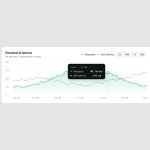





Your SaaS dashboard shows twelve charts, all the same size.
A user opens it, sees a wall of numbers, and can’t tell which ones are more important.
When renewal comes around, they won’t remember why they’re paying for it.
Hero section redesign concept for Scarlet, @jamesdew_ar
Before → After
What changed:
- The video has a strong central focal point, and the centred headline was competing with it. Moved the headline to the bottom left so it supports the video instead of fighting it
- Increased the headline size to keep a clear hierarchy with the new elements
- Added an eyebrow tag as a trust signal that tells users who they’re dealing with before they read anything else
- Added a primary action next to the headline, so the message leads straight into a conversation
Happy to walk the Scarlet team through the thinking behind it


Your SaaS dashboard looks great in the demo. Real data, full charts, everything working.
Then a new user logs in for the first time and sees zeros. Blank charts.
An empty screen doesn’t excite anyone. It just makes your product feel like work they have to do.
Show them what it looks like once their data is in. Then make the setup easy, and do as much of it for them as you can.
Shipped a new feature for your SaaS this morning? It should be on your website by the afternoon.
Not next sprint. Not whenever the developer has time. Not when your AI credits reset.
If your team can’t keep the site up to date, it’s holding you back.
SaaS companies move fast. New features, new pricing, new customers every month.
If every website change means waiting on a developer or your AI credits to reset, it’ll always be a step behind.
Your site should be able to keep up with your product.

The absolute worst thing a SaaS company can do is lie.
Tell me I can try it for free, then paywall me before I’ve even seen the product. I leave annoyed and disappointed.
Then the emails start. Several a day.
You got my email by tricking me, and now you’re using it to upsell me.
Don’t do this.
Hero section redesign concept for Digital Mirror
Before → After
What changed:
- Reworked the headline so it talks about the problems they solve
- Real features from the product are showcased to back up the message
- Turned the eyebrow tag into a trust signal instead of repeating the headline
- A real next step, “Learn more” doesn’t book demos
- Added basic compliance information

Fixed another small bottleneck in my design business today.
Stopped typing to AI and started talking to it instead.
Way quicker. And no more starting a long message, checking one notification, and forgetting I was even writing something.
When your SaaS company raises, more people look at your website than ever. New buyers, future investors, potential talent.
Most of them land on the version you built before the announcement.
The company moved on. The site didn’t.
Your SaaS company’s funding announcement probably sells harder than your homepage.
The press release names the customers, the numbers and the plan.
Then people click through to your site and find the version from before the raise.

Spent part of this morning clicking “try for free” on a few SaaS tools.
Most of them wanted an account first, then sent me straight to the pricing page.
I don’t mind paying for good software. I just don’t like being told it’s free when it isn’t.
When you’re just trying to finish the design before the meeting but forgot you’re in the new Tesla 😂
Hero section redesign concept for DesignVerse
Before → After
What changed:
- Changed the layout to create a much more impactful and long lasting first impression
- Made the industry they work in more prominent and obvious
- Added trust signals with partner logos
- Rewrote the supporting copy to name the problem they solve

If your SaaS button says “try for free”, people expect to actually try it
Not make an account just to land on a pricing page
It’s the very first thing they do with your product, and it starts with a lie
