

Design Partner for SaaS & Consumer Apps II Website : https://xitter.cf/t.co/zI7WtN8Rrw
Melbourne, Australia
Joined November 2018
- Tweets38.3K
- Following672
- Followers1.9K
- Likes103K



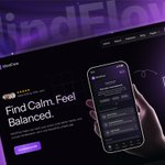


A bold, futuristic AI product concept that positions the assistant as a smart teammate through immersive visuals and strong hierarchy.

A sleek dark-mode energy monitoring interface designed to make usage, savings, and system performance easy to understand at a glance.


A kiosk that only works if you're 5'10" is a liability.
We designed the MissPompadour POS for people of any height, then extended the same flow to mobile via QR Code so the handoff between screen and phone is instant.
One experience. Two surfaces. Zero friction.
That constraint is what made the design better.

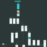
A detailed flow map that visualizes the full user journey and helps align design decisions, interactions, and developer handoff with clarity.

Not only visual focus, clearly showing value proposition of the platform with cosmic sky and messaging that ties into server status and new worlds.

A refined, immersive hero section that uses lighting, depth, and contrast to create a more cinematic brand presence.

Friendly home experience that makes booking laundry feel simple, fast, and service-focused from the very first screen.

This visual direction emphasizes mood and depth while keeping the core product visible in the foreground. It was designed to feel cinematic and modern, while still supporting usability.

I created multiple component and layout variants to test structure, spacing, and visual priority. This helped identify the most consistent pattern for the final interface system. Which one would you select, and why?

This is where most retail UX falls apart, the moment a customer has to make a decision.
Choose your shade. Choose your finish. Pick the right product for your surface.
We designed this flow so it guides without overwhelming. Every screen reduces the decision, not expands it.
Fewer choices shown at the right time converts better than more choices shown all at once.

A cleaner onboarding step that simplifies profile setup and makes user input faster, clearer, and easier to complete.
Now they don't need to toggle for CM/Ft, they can see both value at the same time.

A broader website exploration that combines property storytelling, gallery presentation, and booking-oriented design into one elegant experience.

The kiosk gets you started. The mobile keeps you moving.
Scan the QR, pick up your project list, find the product on the shelf- no staff needed.
We designed this handoff because the drop-off in retail isn't at the entrance. It's at the shelf, when customers can't find what they came for.
Solve the right problem.

A streamlined invoice-creation flow that simplifies billing details, date selection, and invoice generation from one focused modal.

A more human support experience where contact options like email, phone, and WhatsApp are clearly visible up front. Adding real team faces helps build trust and shows that users are reaching actual people, not just a generic help page.

A polished fintech landing page that balances storytelling, product value, and conversion-focused design.

This concept focuses on premium positioning through atmosphere, lighting, and strong visual contrast. The screens were composed to make the product feel more immersive and high-value.

Before designing a single screen for kiosk, we studied what already exists.
McDonald's. Burger King. Hesburger. Measuring tape in hand, phones out, ordering food we didn't need.
SWOT analysis on every kiosk we could find, what works, what breaks, where users hesitate.
Most design projects skip this. It's where the key decisions get made.

Good interfaces reduce thinking, not just decorate screens.
The redesign restructures the layout, surfacing server stats, connection details, and tags into clear sections instead of stacking everything in one block.
By separating information and strengthening hierarchy, users can scan status, verify details, and act faster without searching through the UI.
