

Design Engineer Crafting experiences and systems with taste.
Joined February 2026
- Tweets256
- Following54
- Followers30
- Likes646




Joyful experience indeed🌟.

Particle 404 block live now on VantaUI.
An interactive 404 made of blue particles that scatter on click and spring back into place.
Live Preview -> vantaui-registry.vercel.app/…
26
Gerald D. retweeted

Tween Reviews block live now on VantaUI.
A draggable review carousel with inline portrait videos, edge fades, and an animated pagination track.
Live Preview -> vantaui-registry.vercel.app/…


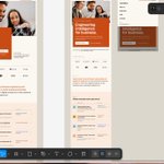
Redesigned the hero of blinka.co, a USD banking platform. @jplinares99 @GetBlinka What do you think?
Same brand. Now the hero shows what Blinka does, not just how it looks.
Here’s what the original is missing and what I changed. 👇


Gerald D. retweeted
Honeycomb Card component live now on VantaUI.
A portfolio health card with an animated score and a honeycomb heatmap that highlights the category you hover or select.
Live Preview -> vantaui-registry.vercel.app/…


I redesigned the spacesheep.dev hero.
Old version described the product. New one starts with the real problem: agents write faster than you can read.
Here’s the before and after.
@micmakarov and @koomen — let me know what you think.


Gerald D. retweeted
Workspace Switcher component live now on VantaUI.
A compact workspace switcher with sortable team rows, spring hover highlights, and a stacked popover with workspace and member actions.
Live Preview -> vantaui-registry.vercel.app/…
Feature lists are dead. I redesigned the hero of spacesheep.dev to lead with the real problem every team using agents already feels: your agents write faster than you can read. That single decision drove everything else.
@micmakarov — let me know what you think.


Built this clean website with user experience and accessibility as the priority.
Smooth, intentional, and focused on the details most people overlook.
Tech stack:
TypeScript · React · Next.js · Payload (CMS + backend) · Shadcn UI · GSAP · Motion · Lenis
#WebDesign #webdev #React #UIUX
I'm always iterating on the small interactions that make a site feel polished — things like scroll behavior, hover states, loading transitions, and micro-animations.
These details are usually the first to get skipped when rushing to ship, but they’re what separate a functional site from one that actually feels good to use — and what keeps users coming back and sticking around.
2
38