

Helping growth-stage B2B AI & tech startups become easier to understand, trust & buy from. Clients raised $15M+. Brand, web & product → https://xitter.cf/t.co/k1b7LOeliO
Partner with Atreo ⭢
Joined October 2024
- Tweets7.8K
- Following439
- Followers2.3K
- Likes9.3K


A B2B SaaS startup can lose a $50K/year deal after a great demo because the person who loved the product couldn’t convince the rest of their company.
And I think this is something a lot of founders overlook when designing their marketing website.
The person who books your demo isn’t always the one making the final decision. They might still need approval from their CEO, finance team, IT department, or whoever controls the budget.
And suddenly, your website has another job.
That buyer needs to explain what your product solves, how it fits into their existing workflow, what implementation looks like, and why the investment makes sense.
If all they can find are generic claims, a few screenshots, and a “Book a demo” button, you’re making that conversation unnecessarily difficult.
When I’m designing a B2B website, I want to make those conversations easier through clear use cases, relevant product examples, integration details, and proof that buyers can actually share internally.
Because your website shouldn’t stop selling when someone books a demo.
It should help them sell your product to everyone who wasn’t on the call.
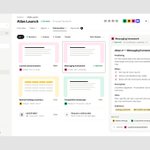
Been exploring the design for a new email app.
The idea was to make it easier to see what actually needs your attention, without digging through a crowded inbox.
So we designed a Focus view that prioritizes important conversations and deadlines, while keeping everything else organized.


Marto retweeted
If your B2B SaaS sales team spends 15 hours a month explaining pricing to prospects who can’t afford your product, your pricing page isn’t qualifying leads. It’s creating more work.
I keep seeing companies hiding everything behind a “Contact sales” button.
No starting price, no explanation of what drives the cost, and no way for buyers to understand whether the product fits their budget.
So someone books a 30-minute call, only to discover they can’t afford the $20K/year contract.
That’s half an hour your sales team could’ve spent with a qualified prospect.
And don’t get me wrong, I’m not saying every B2B SaaS needs public pricing.
But I’d at least make sure buyers understand the pricing model, what affects the cost, and who the product is actually built for.
Because making people book a call doesn’t automatically make them qualified leads.
Sometimes you’re just making your sales team do the job your website should’ve done.
Here's the second direction we explored for this section.
This time, I wanted to focus less on the agents' individual identities and more on what they can do independently, and where the team steps in to review and approve their work.


I had a call with a B2B AI founder spending $20K/month on user acquisition, only to watch new signups drop off before they even experienced the product’s value.
The problem? Users signed up, landed on an empty dashboard, and were greeted with a “Create your first project” button.
From there, they had to configure settings, add data, and figure out what a successful first project should even look like.
Founders often see that as flexibility. First-time users see homework.
When I’m designing a first-time experience, I want to understand what users came to accomplish and how quickly we can help them get there. That might mean a realistic sample project, a relevant template, or a guided first action that produces an actual result.
Because every user who leaves before experiencing the product’s value represents acquisition spend that never gets a chance to pay off.
And spending more money bringing users in won’t fix an experience that gives them no reason to stay.
Marto retweeted
Another hero direction we explored for modo’s marketing site.
The previous one was more brand-led. This time, I wanted to make the product’s value clearer by showing how four AI agents share context, hand off work, and bring humans in when decisions are needed.
The goal was to show how the whole system works together, not just what each agent does.

Another section we've been working on for modo’s marketing site.
Shared context is one of the most important parts of the product, but it's not the easiest thing to communicate visually.
So we built the section around a single project brief, showing how each agent uses different pieces of the same information without the team having to explain everything over and over again.

Been refining the “How it works” section for modo’s marketing site.
Showing four AI agents was the easy part. The real challenge was helping potential customers understand how they'd actually work together on a project.
So we built the section around one launch brief, showing what each agent produces, where the team needs to step in, and what happens after approval.

Marto retweeted
We recently started exploring modo’s marketing site as well. Here’s one of the first hero directions.
After working on the brand identity and product experience, we wanted to bring both together in a way that felt cohesive.
The idea was to let the four agents’ identities give the site its personality, while the product preview shows how they actually work together.

Marto retweeted
For Kern, a compute infrastructure company, the challenge was making performance and scalability feel tangible without the usual tech clichés.
We built the identity around a modular grid, using density, rhythm, and contrast to create a distinctive visual language that feels both technical and credible.


If your B2B SaaS sales team spends 15 hours a month explaining pricing to prospects who can’t afford your product, your pricing page isn’t qualifying leads. It’s creating more work.
I keep seeing companies hiding everything behind a “Contact sales” button.
No starting price, no explanation of what drives the cost, and no way for buyers to understand whether the product fits their budget.
So someone books a 30-minute call, only to discover they can’t afford the $20K/year contract.
That’s half an hour your sales team could’ve spent with a qualified prospect.
And don’t get me wrong, I’m not saying every B2B SaaS needs public pricing.
But I’d at least make sure buyers understand the pricing model, what affects the cost, and who the product is actually built for.
Because making people book a call doesn’t automatically make them qualified leads.
Sometimes you’re just making your sales team do the job your website should’ve done.
Another hero direction we explored for modo’s marketing site.
The previous one was more brand-led. This time, I wanted to make the product’s value clearer by showing how four AI agents share context, hand off work, and bring humans in when decisions are needed.
The goal was to show how the whole system works together, not just what each agent does.
For Kern, a compute infrastructure company, the challenge was making performance and scalability feel tangible without the usual tech clichés.
We built the identity around a modular grid, using density, rhythm, and contrast to create a distinctive visual language that feels both technical and credible.
We recently started exploring modo’s marketing site as well. Here’s one of the first hero directions.
After working on the brand identity and product experience, we wanted to bring both together in a way that felt cohesive.
The idea was to let the four agents’ identities give the site its personality, while the product preview shows how they actually work together.
I had a kickoff call recently with a B2B SaaS founder spending $15K/month on customer support. His team was answering the same basic product questions every single week.
Every time a user can’t find a feature, understand a metric, or complete a task, someone from support has to step in.
That’s time, salaries, and resources spent explaining things the product should make clear.
And as the customer base grows, those costs can grow with it.
Before redesigning anything, I’d review the most common support tickets, identify where users get stuck, and fix the navigation, information hierarchy, and interactions causing that confusion.
Don’t get me wrong, customer support is essential. But there’s a difference between helping customers solve real problems and constantly explaining how to use your own product.
If the same UX issue generates support tickets every week, you’re paying to deal with it every week instead of fixing it once.
Marto retweeted
Still exploring modo’s product experience. Here are a few more screens from the multi-agent AI workspace.
The goal was to make working with four AI agents feel like one coordinated workflow, with clear tasks, dependencies, and approvals.
So teams can delegate work without losing track of what’s happening or when they need to step in.


Recently, we kicked off a new project for Dreumy, a sleep and wellness app that connects daily habits with better sleep.
The challenge was making users understand the value of tracking their habits before asking them to start, and making the experience simple enough to keep coming back.
So we’ve been exploring everything from onboarding and sign-in to the daily home experience, in both light and dark modes.
A few early explorations so far.

Still exploring modo’s product experience. Here are a few more screens from the multi-agent AI workspace.
The goal was to make working with four AI agents feel like one coordinated workflow, with clear tasks, dependencies, and approvals.
So teams can delegate work without losing track of what’s happening or when they need to step in.
Marto retweeted
A B2B SaaS dashboard can show 40 different metrics and still fail to answer the one question users opened it for: what actually needs my attention?
I think too many teams confuse showing more data with delivering more value.
More charts, more filters, more ways to analyze everything. Looks impressive in a product demo.
Then the customer logs in on Monday morning and has to spend 15 minutes figuring out which numbers matter, why they’ve changed, and what to do about them.
And that’s where I think design teams should be asking different questions.
What decisions are users trying to make? Which signals actually matter? What context do they need before taking action?
Those answers should shape the information hierarchy, visualizations, and interactions. Not how many metrics we can fit on a screen.
And don’t get me wrong, some users genuinely need that level of detail.
But there’s a difference between giving someone access to information and making that information useful.
If your dashboard shows users everything but helps them understand nothing, you’ve built a pretty expensive spreadsheet.