
Smart brand design for ambitious companies. We love the decisive and obsessive — one eye on the big picture, the other on the details, details, details.
SC/VA
Joined May 2024
- Tweets14
- Following2
- Followers93
- Likes6

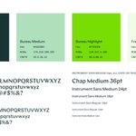


We love independent type foundries, but convincing clients to spend on fonts is tricky. Sometimes we pair indie fonts with free ones to create opportunities for unique expression with lower licensing costs. Like @schicktoikka’s Chap w/ Instrument Sans, available on Google Fonts.


Warm retweeted
☀️ New brand for Daylight ☀️
Warm worked with Daylight to update their identity and web presence. The previous Klein Blue coldness ran counter to the values we identified in the discovery phase. So we went Very Orange, then deep on the details.
Full case study link below ↓

Warm retweeted
🧬New work for Arktos🧬
Warm has been working with Arktos Life Sciences to give their groundbreaking bioscience research a life of its own. I can’t recall the last time I’ve learned so much about the world in a project! It’s 24/7 geeking out.
Full case study link below ↓
Warm retweeted
Just so I don’t bury the lede: @warmdotdesign has some availability before getting busy in January.
One of the many benefits of working with early stage companies is being able to collaborate directly with founding teams to shape foundational aspects of a company’s brand, voice, and perception. One of the only downsides is sometimes they need to pause that work to (rightly!) focus on their product and market before our work is the best it can be.
We’ve got some availability until the Christmas holidays while one of our clients is in heads down mode and another is closing their next round of funding, so if you’re looking for a design partner, we’d love to chat!


Warm retweeted
This @warmdotdesign biosciences brand project has already had a lot of darlings end up on the cutting room floor — and we’re only a couple of weeks in. We just really love making logos. We can’t stop.
A Good Summer, Part 2
Warm spent part of our Summer working on an expansive brand identity and web expressions for Daylight.
A bold energy startup with the audacious goal of building the world’s largest decentralized, sustainable power plant needed an equally bold identity. We combined a super-scalable, optimistic D monogram (simply nicknamed “El Sol”), a single workhorse typeface, and a flexible grid system as the infrastructure for the brand to grow. I can’t wait to rock El Sol on hat!
@warmdotdesign makes things that are thoughtful, artful, foundational, smart, expansive, cohesive, opinionated, fun, human, sturdy, storied, textured, well-edited, and well-crafted. If you like things like that, we’d probably enjoy making them with you, too.
