







Just upgraded to iOS 16. Cue annual ritual of - “wait is this new or has this always been this way?” 🙂 Lots of nice details, especially motion and typography refinements. 👏
1
13
THE IMAGINEERS ORIGINALLY WANTED TO MAKE THE HAUNTED MANSION LOOK ABANDONED AND OVERGROWN, BUT WALT SAID NO BECAUSE HE WANTED ALL OF DISNEYLAND TO LOOK WELL MAINTAINED. HE TOLD THEM, “WE’LL TAKE CARE OF THE OUTSIDE AND LET THE GHOSTS TAKE CARE OF THE INSIDE.”

6

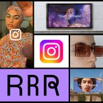
We just launched an evolved brand identity for @instagram, including a refreshed gradient and our first custom typeface, Instagram Sans. Really proud of how this turned out.

Instagram Sans is our first custom typeface, designed in partnership with @colophonfoundry. We took cues from the curves of the Instagram logo and from the script of our wordmark. It’s expressive, legible, and global.
Excited for this new system and the ways we’ll be able to build on it in the months and years to come.
Brand site: brand.instagram.com
More behind the scenes with the talented team who brought this to life: design.facebook.com/stories/…
Apple continues to do really impressive work on accessibility
apple.com/newsroom/2022/05/a…
Love this from @kevin2kelly: "When you lead, your real job is to create more leaders, not more followers."
kk.org/thetechnium/103-bits-…
1
2