

Founding/Fractional Product Designer. Design partner for founders, scientists, & engineers. Founder @ Manmade. Sometimes plays records. Yes, that Jon.
Joined April 2008
- Tweets5K
- Following553
- Followers420
- Likes4K





“Twenty years of articulating direction turned out to be the whole skill.”
I felt that in my bones. Being a “Design Director” has never been more valuable.
Not just 20 years of articulating and critiquing design work, but managing hand-off to engineering as well, has provided me with an unparalleled framework and vocabulary to direct models.

The thing that surprised me most about directing Claude Code in Figma.
I can describe the intuitive solution, not the functional one. "Feel like the money's already landed" instead of "add a confirmation state."
And it lands. Twenty years of articulating direction turned out to be the whole skill.
33
Working on a library of micro-charts for a reporting platform.
I’ve started adding “Director Mode” to Claude builds so I can share animated overviews of the work alongside the clickable prototypes.
Jon Williams retweeted

UI and math time! UI = f(props) is the most famous line in React. But that f is JavaScript, not math.
Inspired by @_chenglou’s Handwired project, I compiled a <Dashboard/> component into a real math function, and asked what becomes possible.
calculus-of-interfaces.verce…


This week’s side project is a Pomodoro timer with a generative soundtrack that’s designed to improve focus, combining soft synths with environmental ambience.
Inspired by an ensō, the Zen circle brushed in a single stroke, the timer draws a circle for the amount of time specified, pauses for a break and draws again. The brush stroke and the soundtrack are all dynamically generated, with the stroke responding to the audio. Like a true ensō, it’s never the same twice.
What started as a simple menu bar timer now has me evaluating chime sensitivity and bristle lag simulation.
This has been my experience building with AI. I might start with a simple idea, but as I delve into the optimal solution the product evolves with the learning and capabilities that are revealed.
For me, this is all still design.
2
3
115
Guidance and prompt for helping agents get closer to parity between builds and design systems in Figma


Works well with the Web Typography skill
github.com/thatjonwilliams/w…

1
1
26

I talk to my Mac all day long.
I used Wispr then Monologue, but any network latency caused a drop out that ruined the flow.
So I switched to Megaphone – github.com/Kuberwastaken/meg… – which uses Apple Intelligence to transcribe on-device. The only issue was that it was that it read pauses as punctuation, requiring manual clean up.
But… it's open-source. So I grabbed the repo and added a setting. Magical!
Props to @kuberwastaken

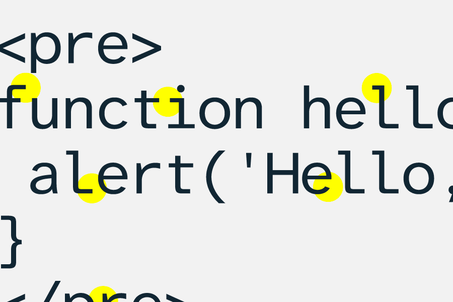
Atkinson Hyperlegible Mono is an open-source monospaced font designed specifically for readability and users with low vision.
Or just really tired developers.
fonts.google.com/specimen/At…


Asset from the identity work for FlyBetter, a carbon-conscious travel calculator.
The mark was derived from the letters FB, leaving a plane symbol in the negative space. After all, the most carbon-conscious way to fly is not to fly at all.
1
1
46

Experimenting with a tool that analyzes websites based on aesthetic – hue, brightness, density, composition, typography, etc. – allowing people that don't have the vocabulary (e.g. clients) to articulate their preferences through navigation and selection.
This test uses 1,200 websites. I already have collections of artworks and interiors for the next pass. What other imagery should I try?