

Graphic Designer ✍️
Macclesfield / Eastbourne
Joined December 2013
- Tweets376
- Following483
- Followers350
- Likes2.4K








Sam Moore retweeted

The whistle's blown and we’re off to a roaring start! Huge thanks to our MVPs and fans for kicking off our #Lab23.
Our team are ready for a winning season of policy goals and a marathon of lively events.
Want in? Join the club 👇
laboursocietyforsport.com
Sam Moore retweeted

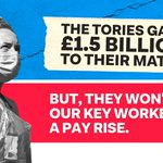
Wee thread of posters celebrating NHS staff
Design by @radical_eyes_uk from our Supporting Key Workers artpack

Sam Moore retweeted
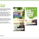
From @SamMoore249 in the same artpack - the illustration was adopted by the Frontline X-Ray Wellness charity in their logo


Sam Moore retweeted
🚨INTRODUCNG: Left Design Festival 2021🚨
October 16th // Online
We're bringing together left creatives from three continents to put on the first (hopefully) annual Left Design Festival
Speakers from @UKLabour / @nzlabour / @BernieSanders / @WideEyeCo & more
Link below👇👇👇👇


Poorly cropped imagery, sloppy vintage throwbacks, horrible mixing of typefaces. Hardly screams "New Chapter for Britain". Should this not be a bold, forward-looking graphic rather than some poorly executed mid-century callback.
This quoted post is unavailable.
Sam Moore retweeted
For a party whose logo is a rose, surprising lack of Labour valentine's material out there


Sam Moore retweeted

NEW: Joint General Secretary of @NEUnion Mary Bousted tells me Gavin Williamson has now “lost the confidence of teachers and parents” and remaining in his post now looks “very difficult”.
Sam Moore retweeted

Will unironically purpose this at my next CLP meeting


The Labour Party leadership say you can't talk about Jeremy Corbyn, so what can you talk about?
Use our motion generator to find out...
forms.peoplesmomentum.com/mo…


