

Software designer who codes and builds with AI agents. Sharing how designers can direct AI. ex: @LottieFiles @GrabSG @ShopBackSG @DesignCodeio @MinitheoryHQ
Singapore
Joined March 2009
- Tweets11.7K
- Following2.8K
- Followers1.4K
- Likes29.5K





Gonna dig up my old iPad now!

A single command to install @omarchy on your iPad
Coming soon
Video is sped up, total install took 3.8 minutes
@OmarchyMac @OmarchyUpdates @dhh @OmarchyLinux @tcballard
Went through my own posts against X's open-source ranking code. Things I didn't know:
• quote-posts can get the small-account boost too
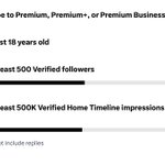
• a user click on Copy Link weighs 30× more compared to Like
• 30 of my 73 posts went out within 10 min of one another, so they were fighting each other 🫣 those become bad posts 🥲
Wrote up the 15-min audit with Grok👇, will testing the strategy on my next posts. You guys can run it on yours too!
🤖 Made with AI


Bold on hover is one of those tiny things that quietly breaks layouts (it's tiny but still doesn't look polished).
Grade is the cleanest fix if your font has it. If it doesn't, 3 more ways to stop bold on hover from shifting:
1. Reserve the width with a hidden bold copy of the label:
a { display: inline-flex; flex-direction: column; }
a::after {
content: attr(data-text);
content: attr(data-text) / "";
font-weight: 700;
height: 0;
visibility: hidden;
overflow: hidden;
user-select: none;
pointer-events: none;
}
a:hover { font-weight: 700; }
with <a data-text="Pricing">Pricing</a>
2. Fake the weight with text-shadow or -webkit-text-stroke when there's no variable font. Neither changes width, just looks a bit softer than real bold
3. For counters and prices, use font-variant-numeric: tabular-nums so digits stop jumping


Peeled an apple in ONE unbroken strip.
Peel length: 3m 88cm and wasted my 9 minutes 😅
#ApplePeel


Watching this to convince myself I don’t need Duo 🫣🥲
youtu.be/5laDGy4INB0?is=1C67…
I love all the iPhone Duo ideas, all the apps/prototypes makes me feels like the time when iPhone 3GS mass adoption era where all the cheeky apps pop up. Collected all the nice examples in this thread for all of us to inspired from! 🤩👇
Do share yours too!
Beautiful notebook! xitter.cf/SpatiallyMe/status/211…

Taking notes on the iPhone Duo is so satisfying… especially when it looks and feels like a real notebook that truly belongs to you.
With TypeDraw you choose what happens when you “open” your book, and you can personalise it with custom colours, fonts and even your own handwriting.
For everyone lucky enough to have their hands on a Duo today: TypeDraw is available on the App Store now. For everyone else: it also looks and works great on regular iPhones 😄
Typewriter xitter.cf/raffiki_art/status/211…


